Making a family yearbook is one of the more daunting book projects one can take on, so perhaps this explains why even I am a bit behind in this area of memory keeping. My desire to have a matching set of annual books lined up nicely on the shelf (you know, something lovely like this) caused a bit of analysis paralysis. I finally just made a decision and moved forward, reminding myself that anything I did was definitely better than these memories being tied up in my computer.
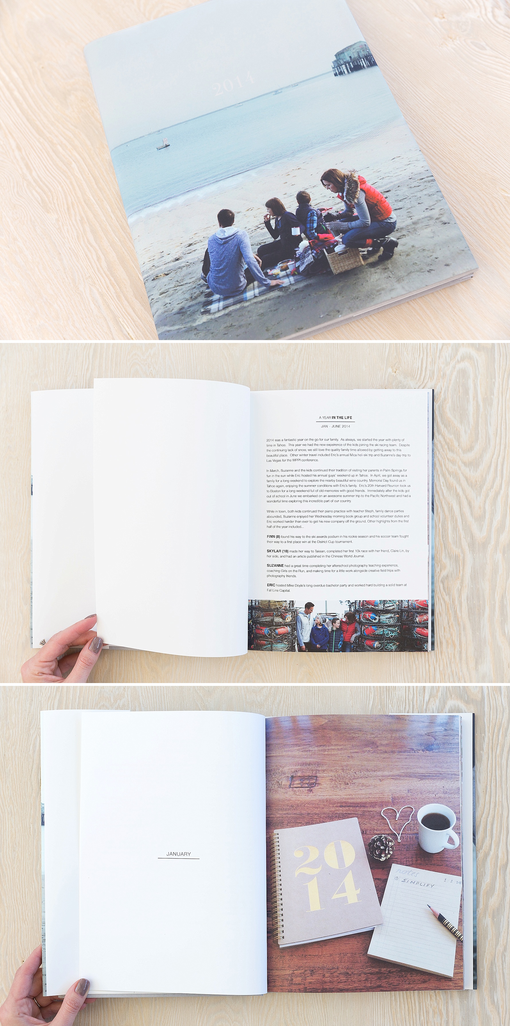
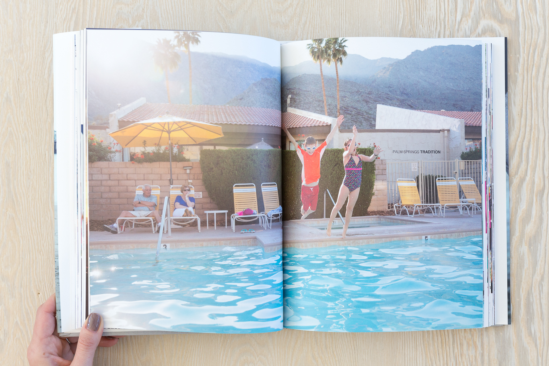
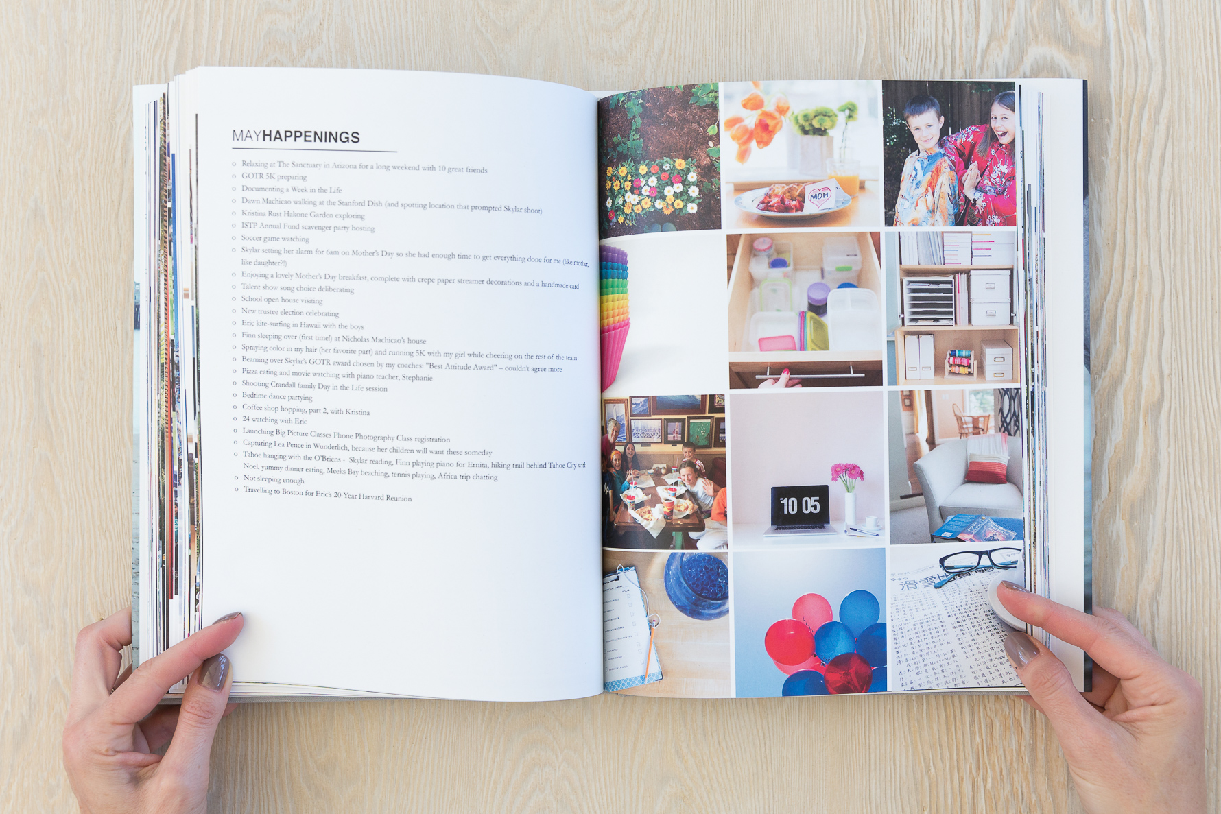
I designed this 2014 album with a two-page introductory layout for each month, followed by one page of highlight stories and a one page grid of miscellaneous images from the month. These two standard layouts were then followed by the images and stories from the rest of that month.
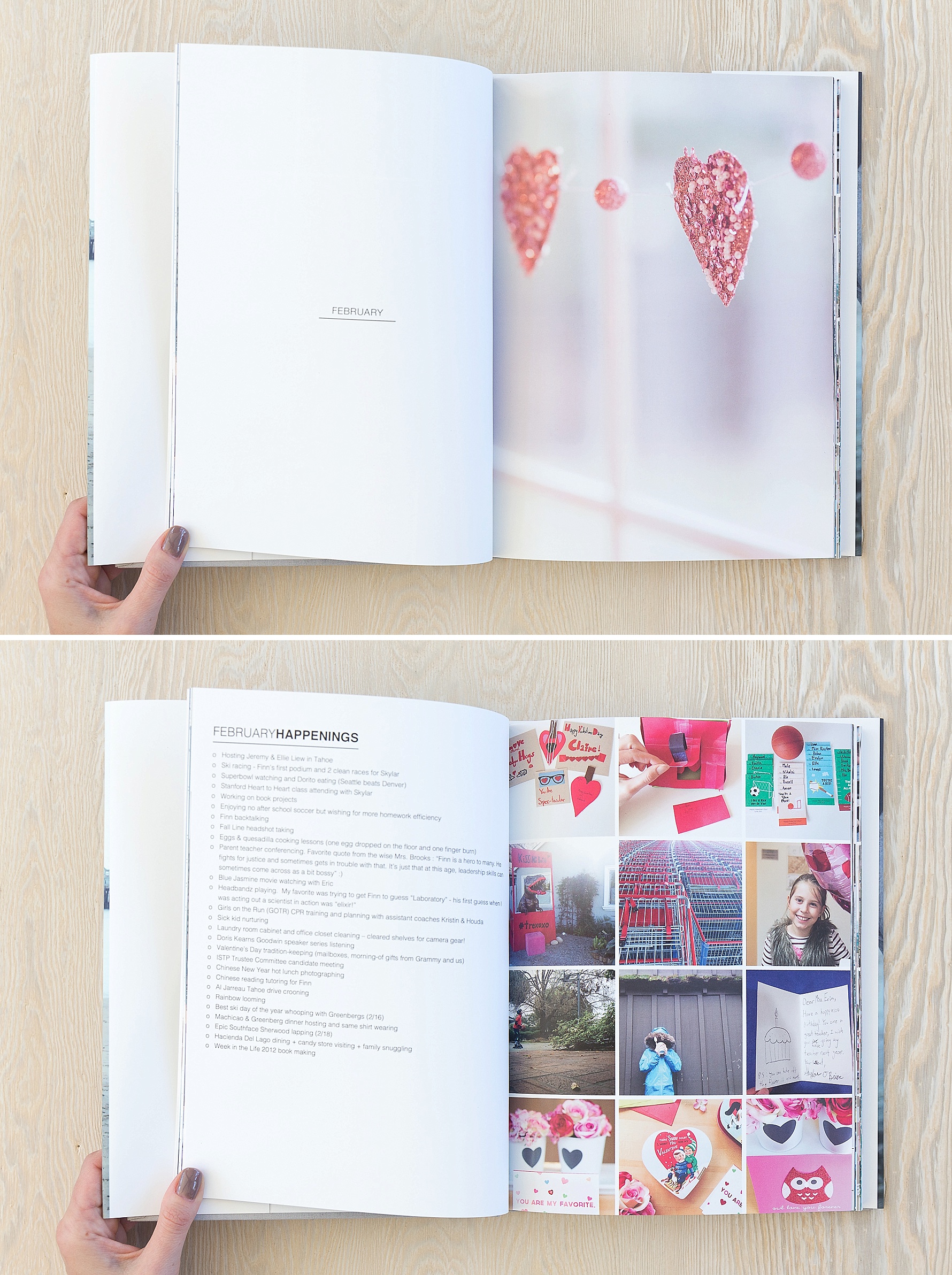
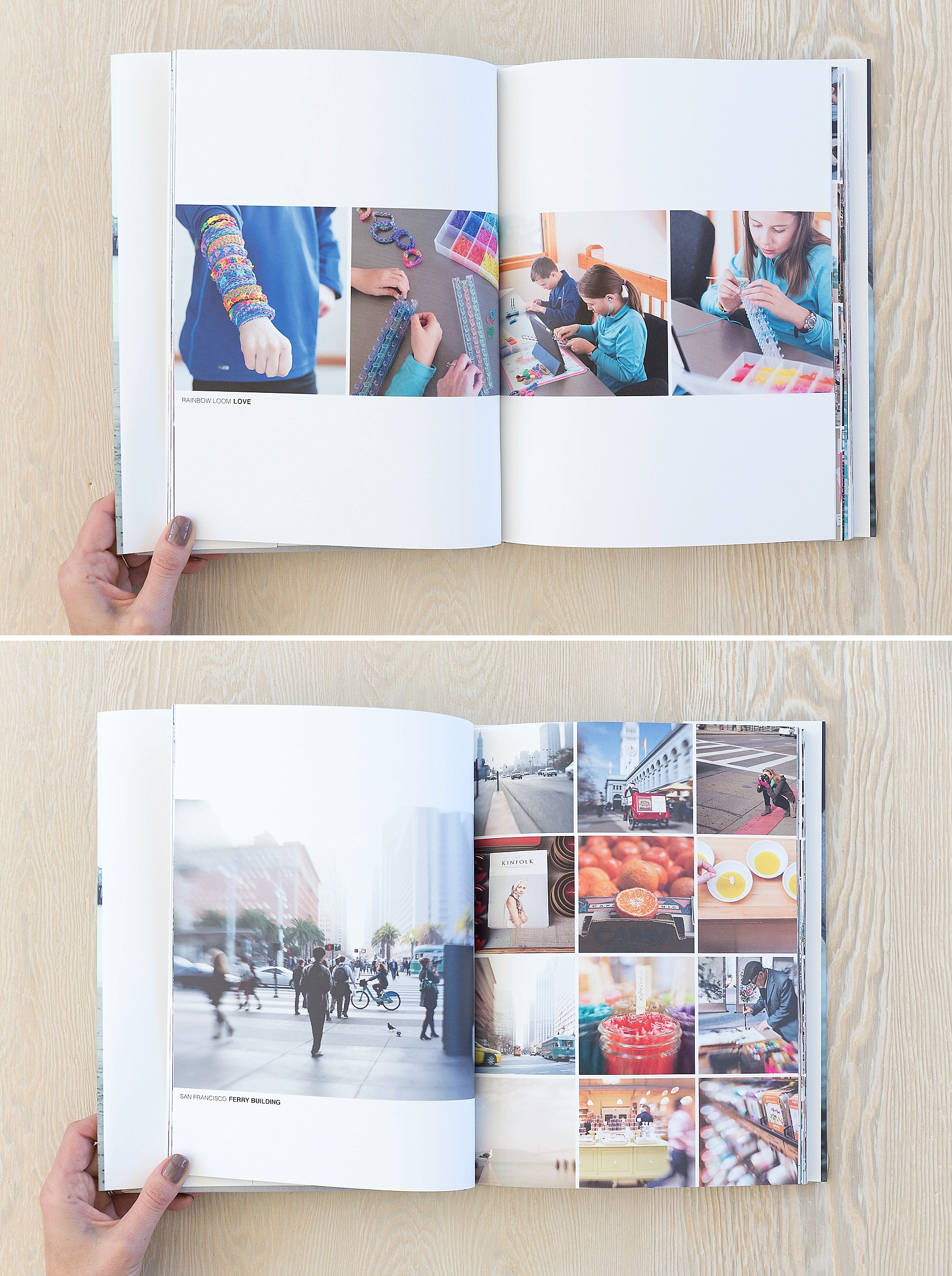
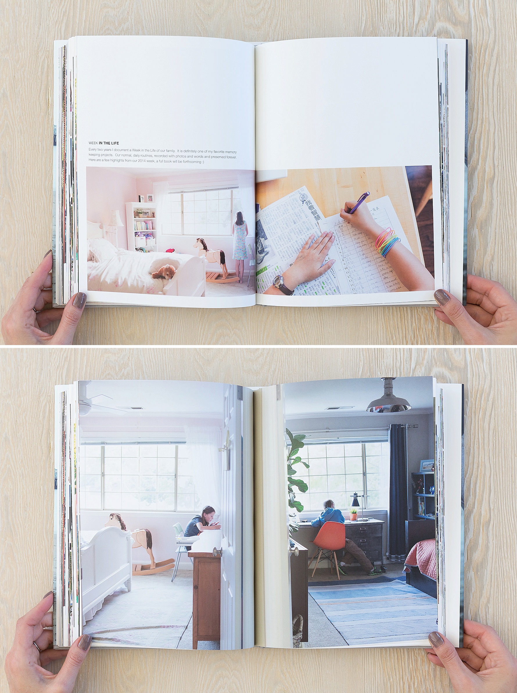
Because I wrote about most of the activities from the month on the monthly “happenings” page, many of the pages that followed often just had a simple title. Other times, a longer story found its way onto the pages.
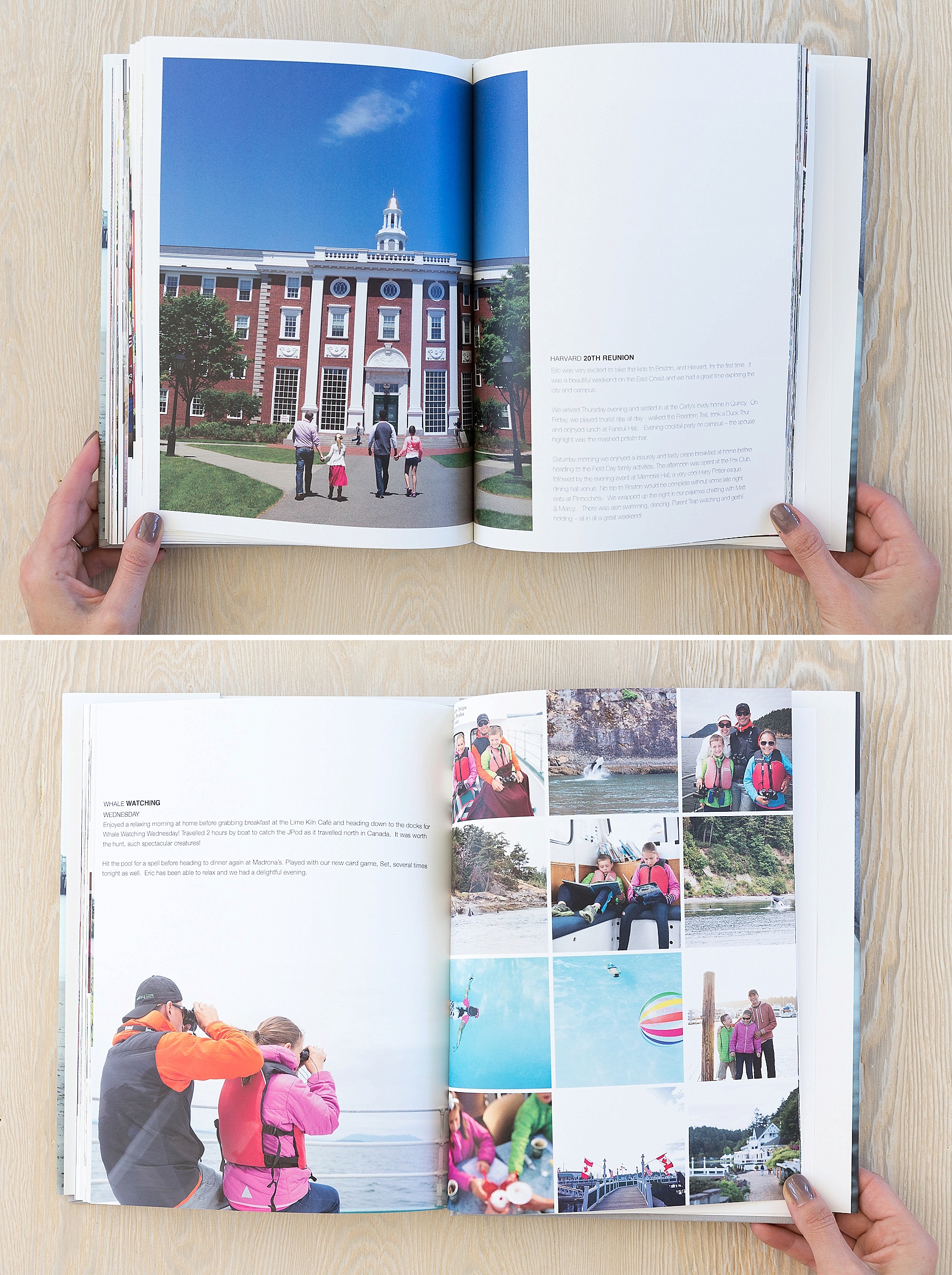
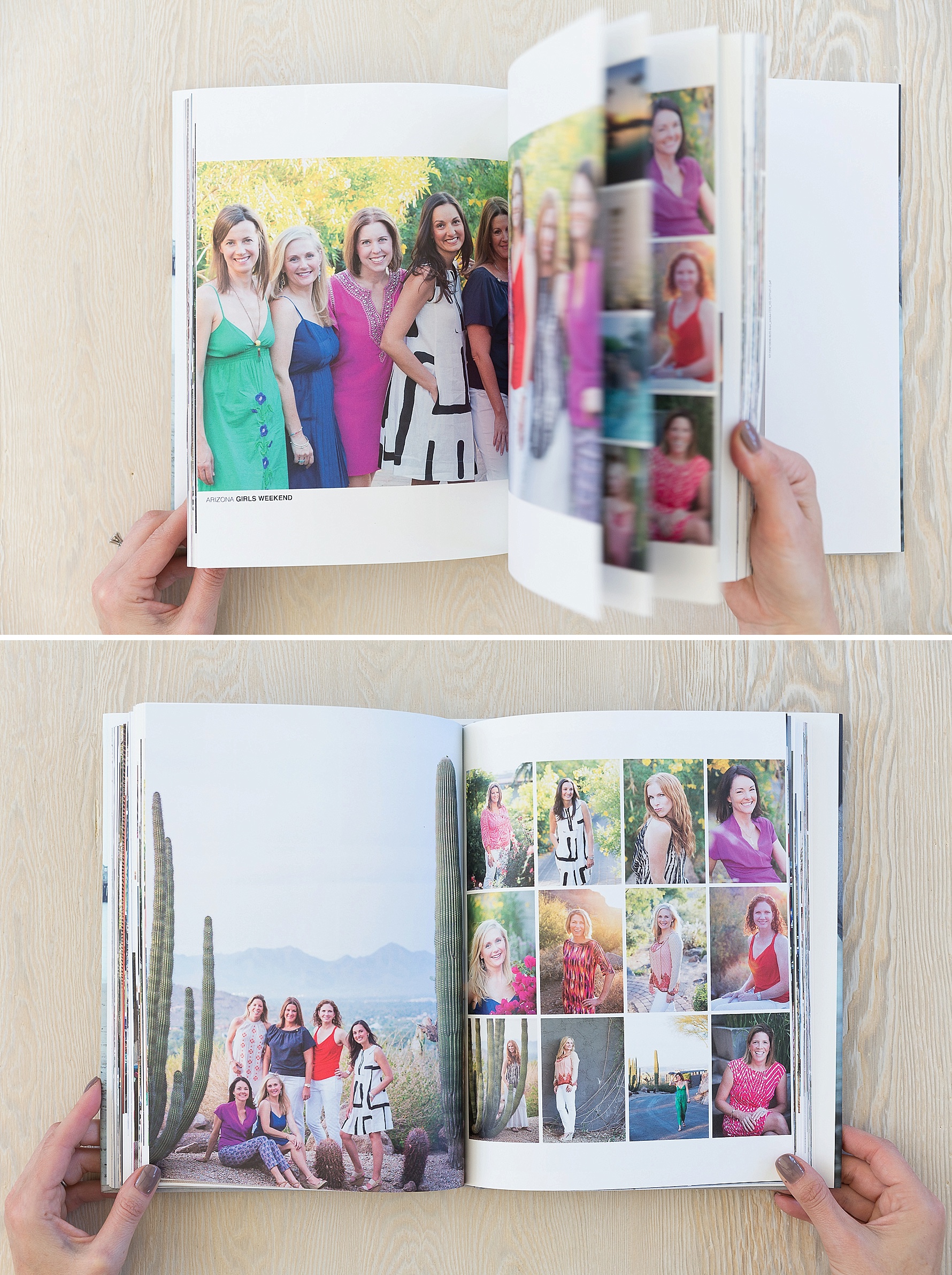
As is always the case with the books I design, some stories required a grid of photos to be told, others warranted a full image on the page…
The “monthly happenings” design I created was quite labor intensive and probably not something I will repeat in the future. 2014 was the last year I used the Oh Life journaling system, before they went out of business :(. This daily journaling system provided me with a lot of great details, quotes and funny stories to accompany my images for the year. That was a lot of content to manage and edit. This will likely not be the case beyond that year, so that should help simplify my annual albums.
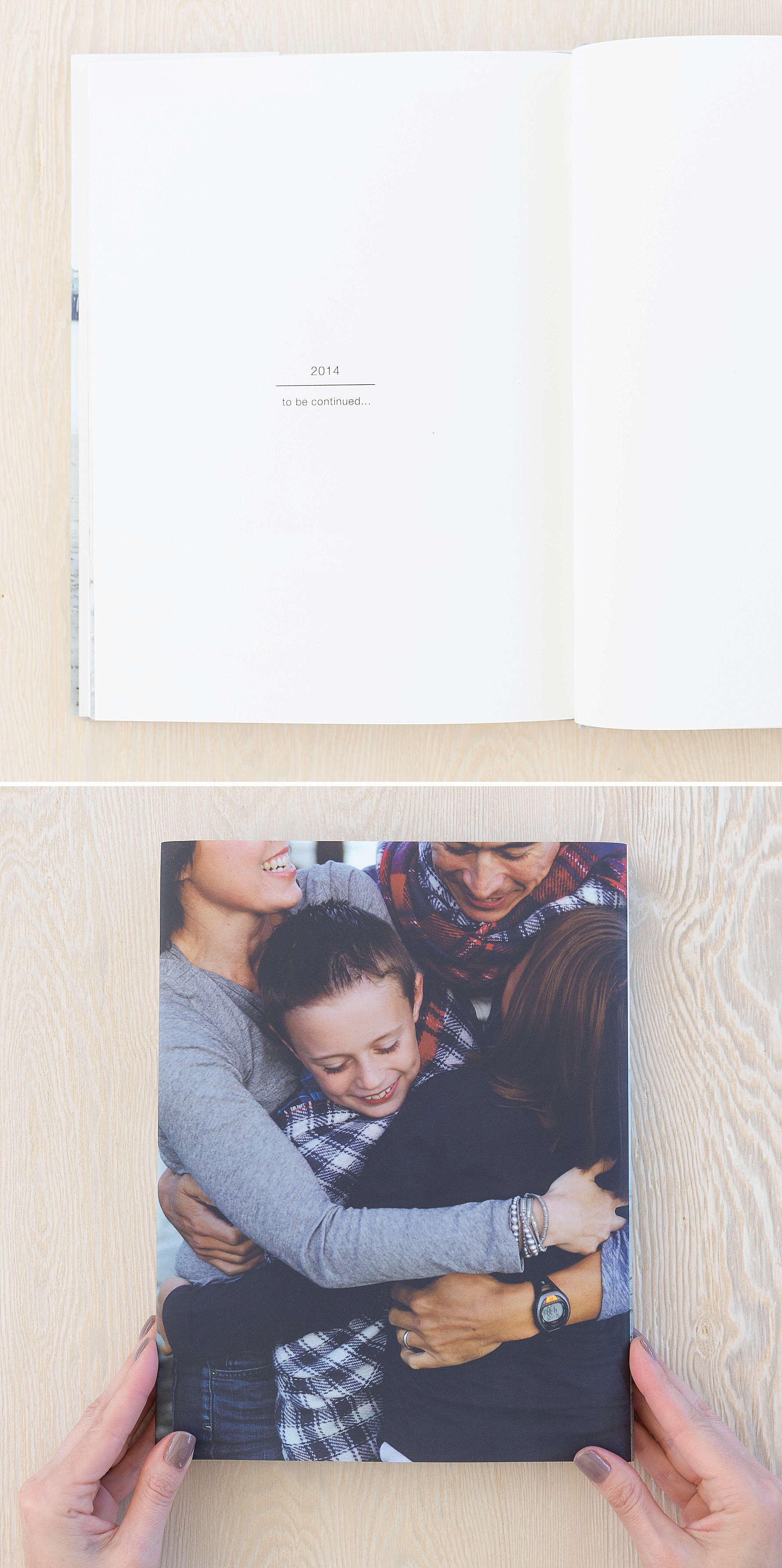
Although I plan to make some changes going forward, ultimately, I love how our 2014 stories were captured in this beautiful (8.25 x 11) album. Well, half of them at least, I maxed out the page count with the first half of our year so stayed tuned for part two…

kristi boyd says
love your clean style!! Thank you for sharing. Is this an artifact uprising album?
Claudia Reyes says
Lovely album! Which company did you use to print this book? I haven’t seen this particular size (8.5 x 11 in) before.
Suzanne says
Thank you both! This was printed by Artifact Uprising, love their product.
Danielle says
Do you love AU more than Blurb?
Suzanne says
Hi Danielle,
Love them both! Blurb offers the ultimate in flexibility (no page limits, editable templates etc.) and value pricing. Artifact Uprising has a beautiful design aesthetic and I also love their 8×8 size. You can’t go wrong with either of them!
Jenya says
Thank you so much for inspiration! The albums look very beautiful and I found many ideas for inspiration. Wish you more and more wonderful albums and memories!