Our most epic family trip yet called for an equally epic photo book.
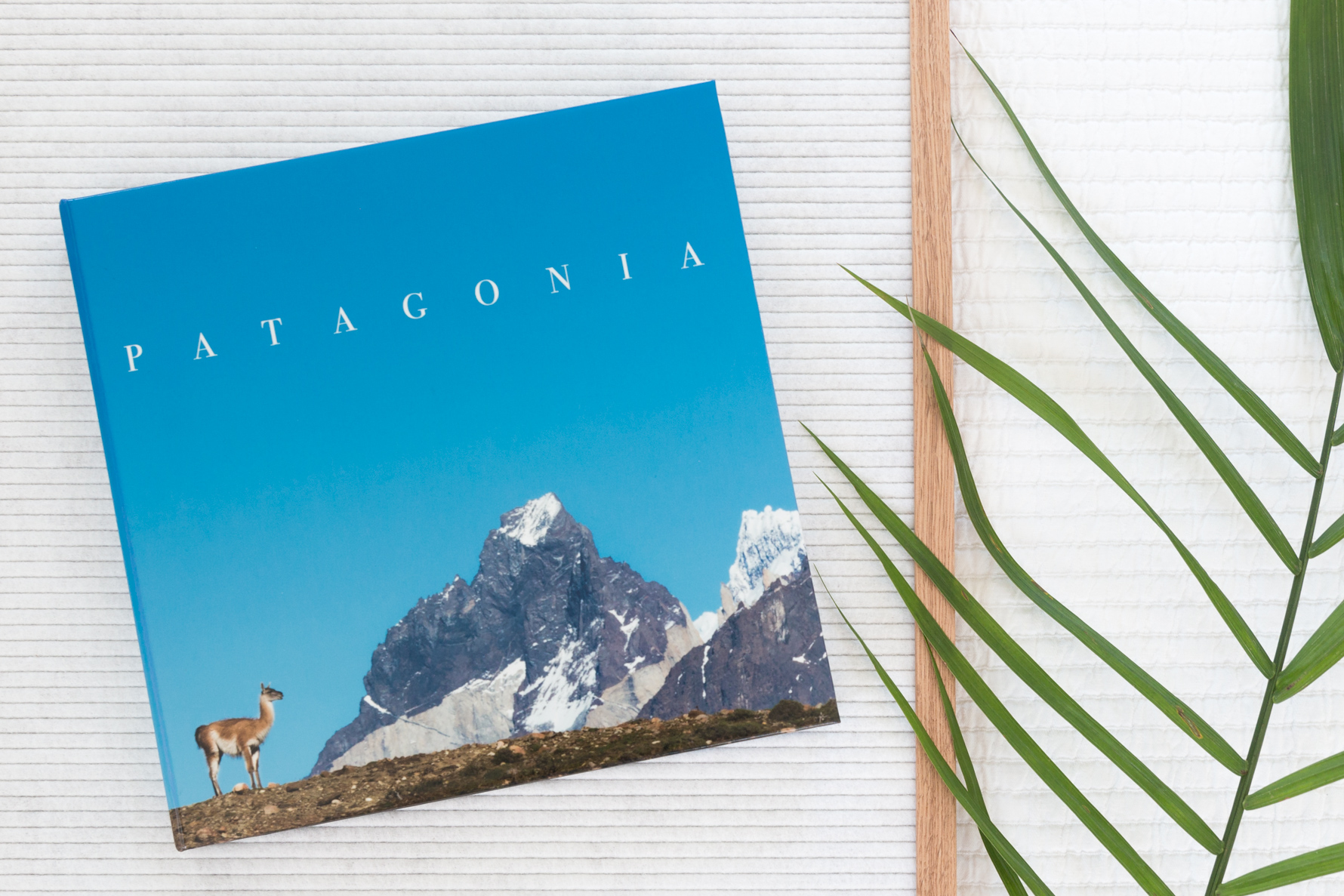
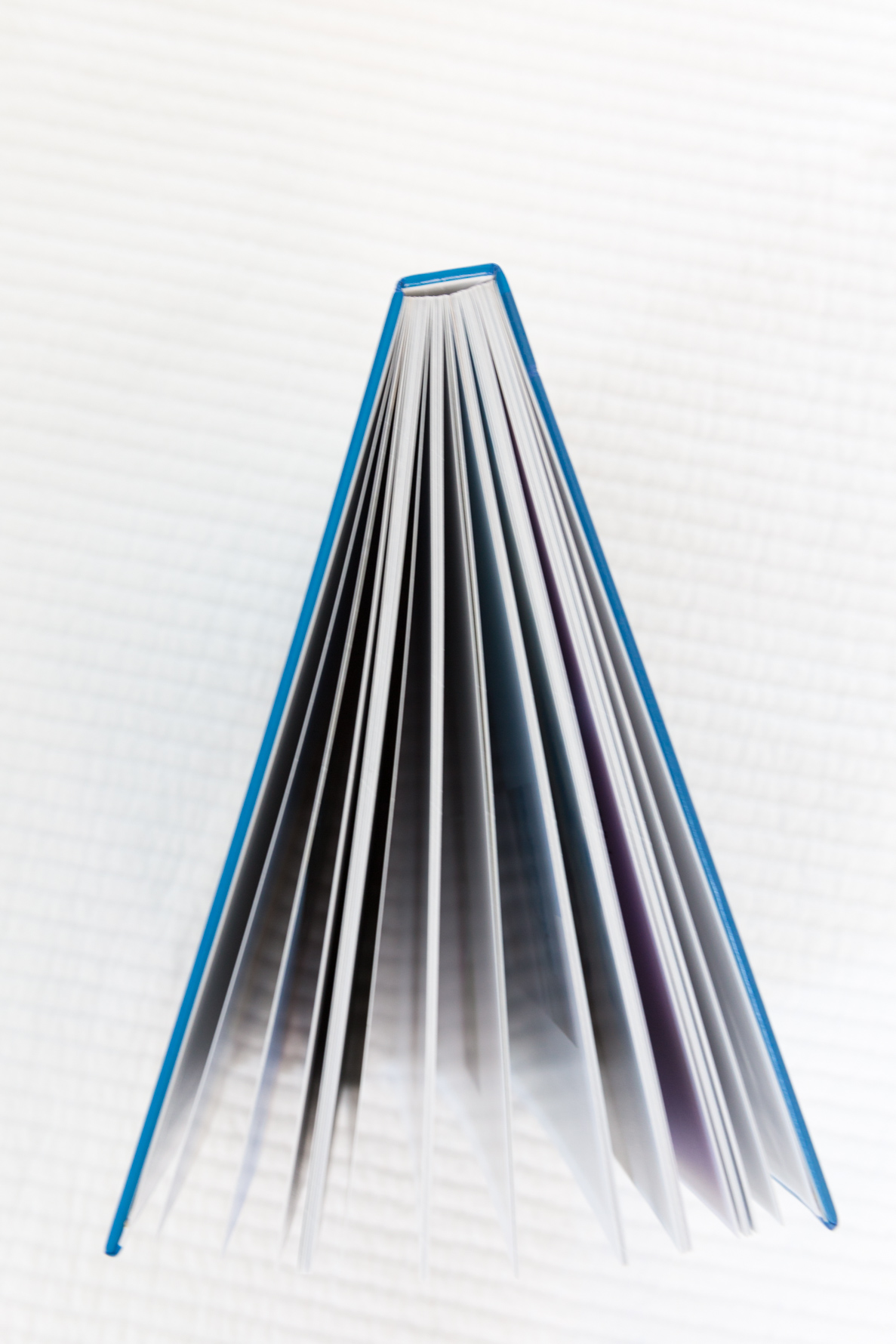
In October of 2014 we made our way to South America, visiting both Argentina and Chile. Our time spent in Patagonia in the national park Torres del Paine was the true highlight of our trip. The beautiful colors and stunning landscapes of this region take center stage in this premium 10×10 layflat album printed on high quality photo paper.
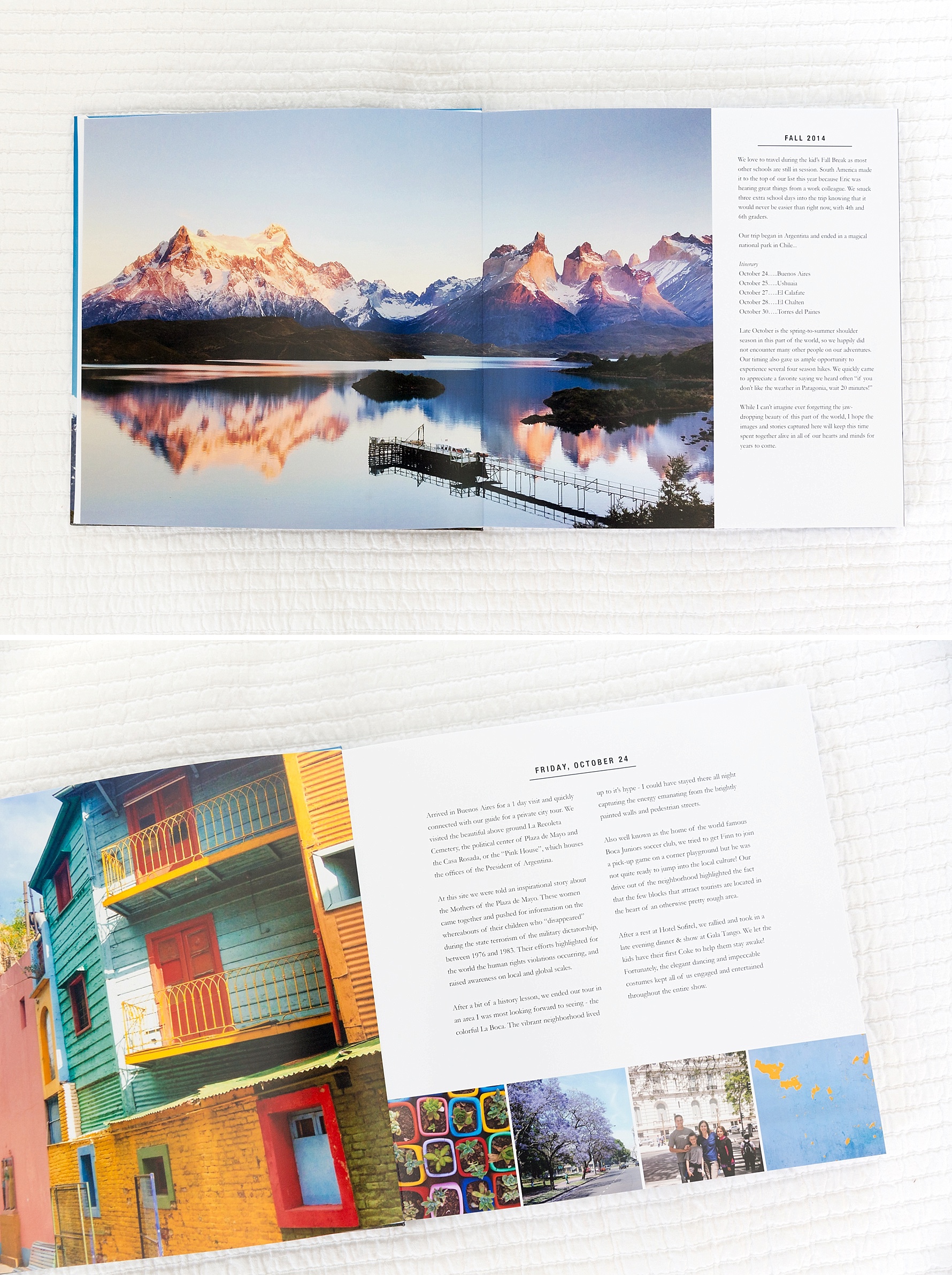
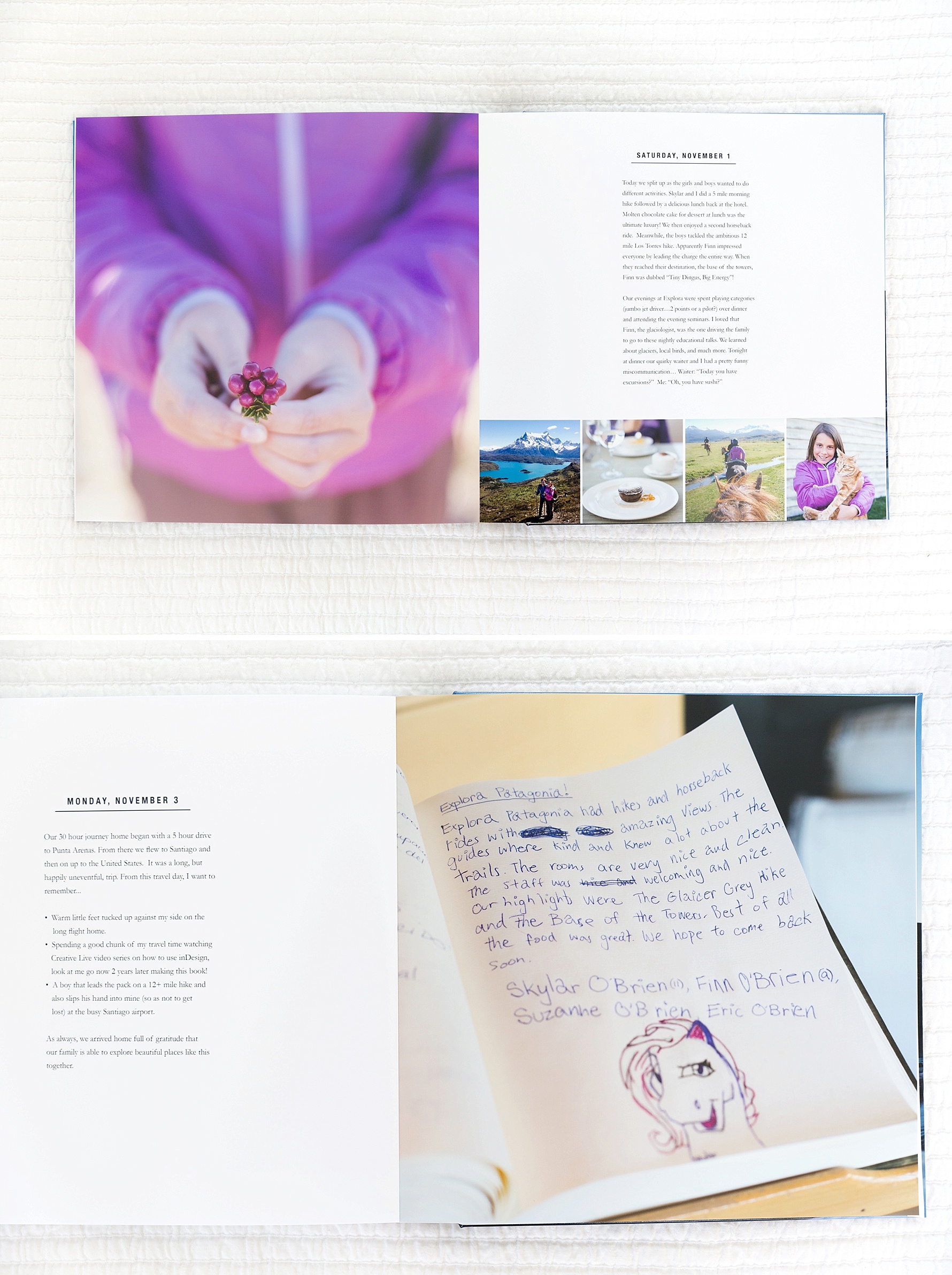
I quickly settled into a rhythm while making this book: a favorite photo from the day paired with summarizing words to open each day. Beneath the text, I added four square photos that didn’t find homes in the daily stories that followed.
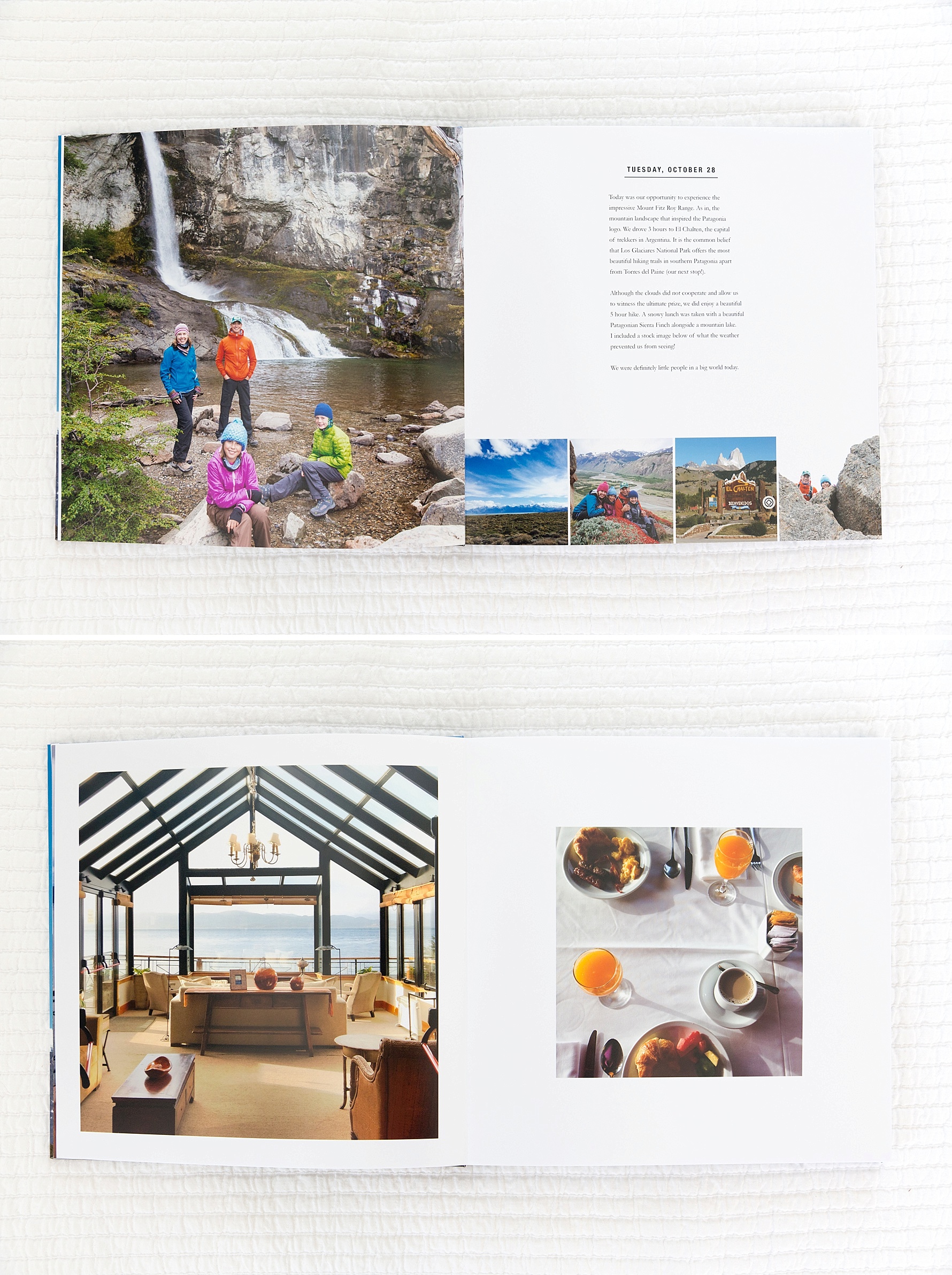
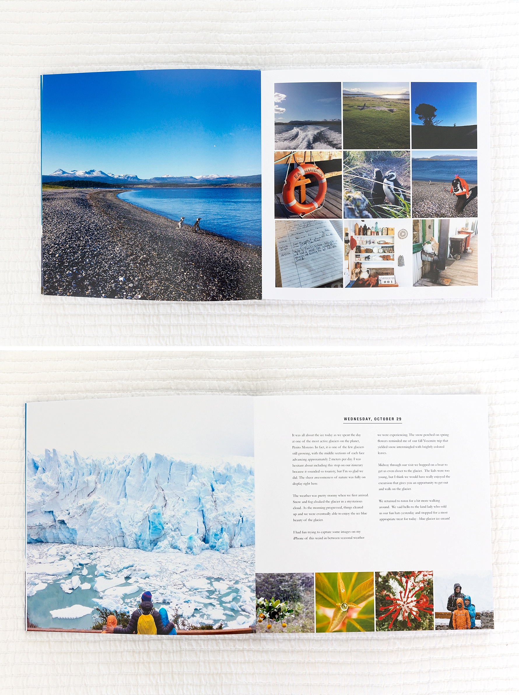
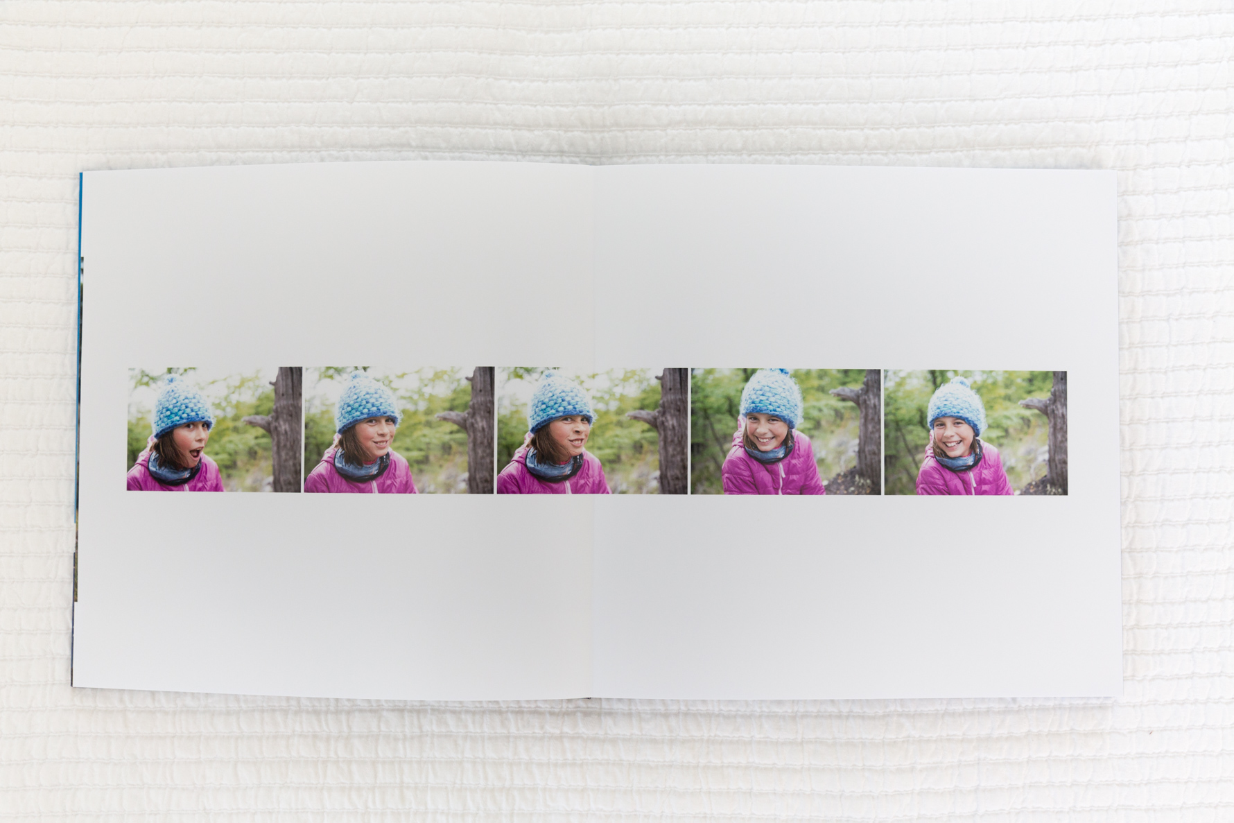
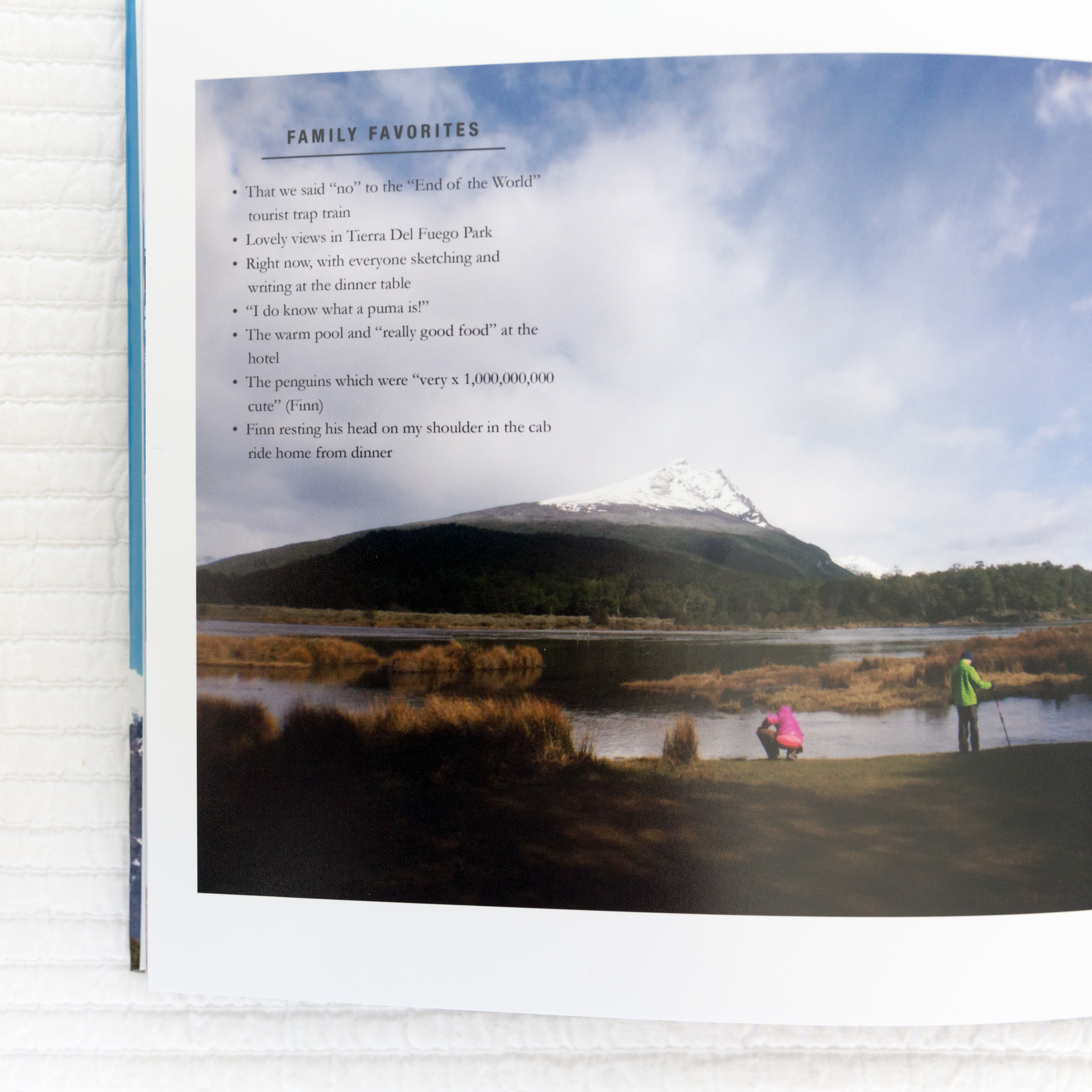
Most nights at dinner I polled everyone for their favorites from the day and then sprinkled those gems throughout the book. These are the details I will never remember if we don’t document them in the moment.
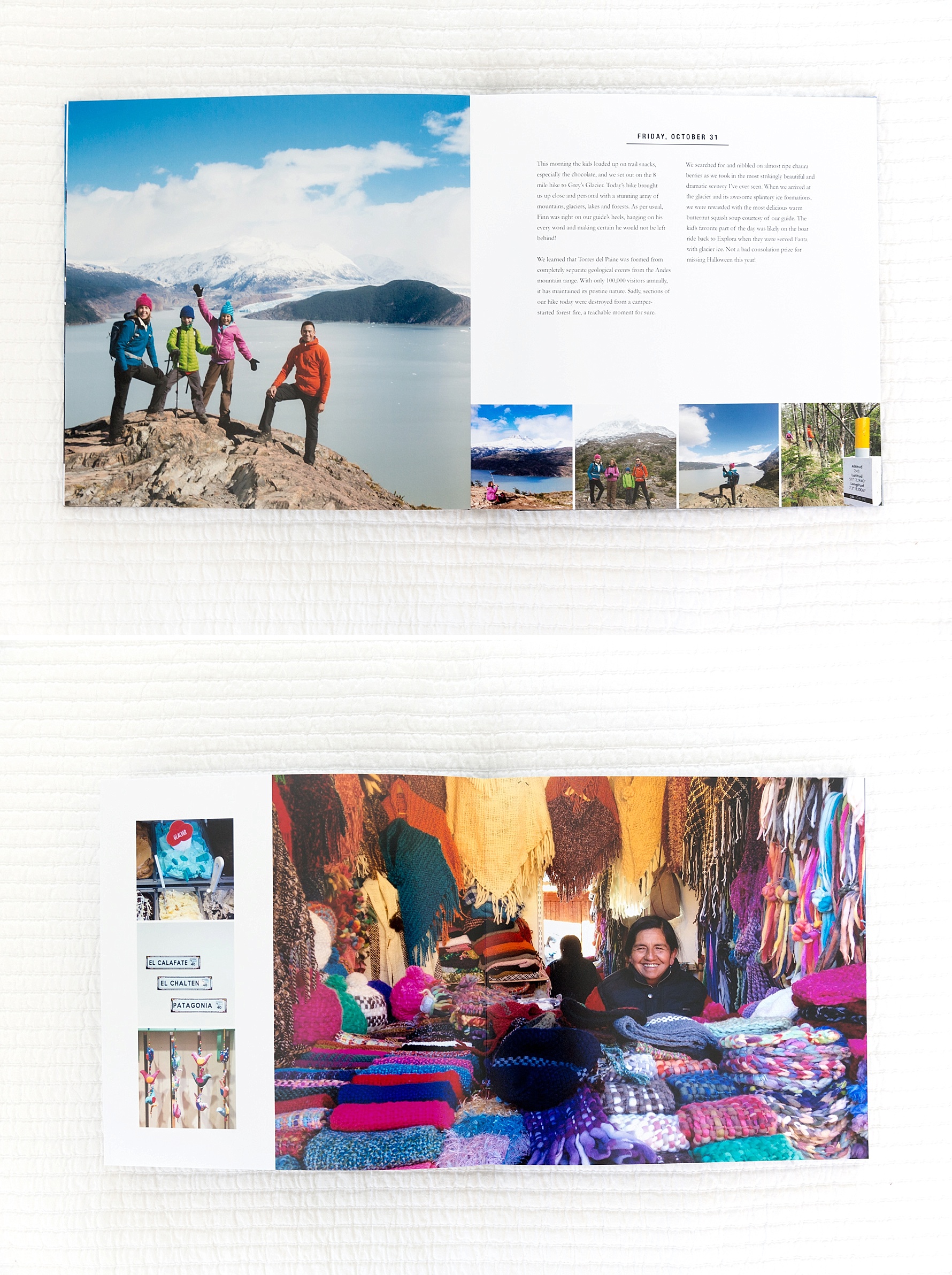
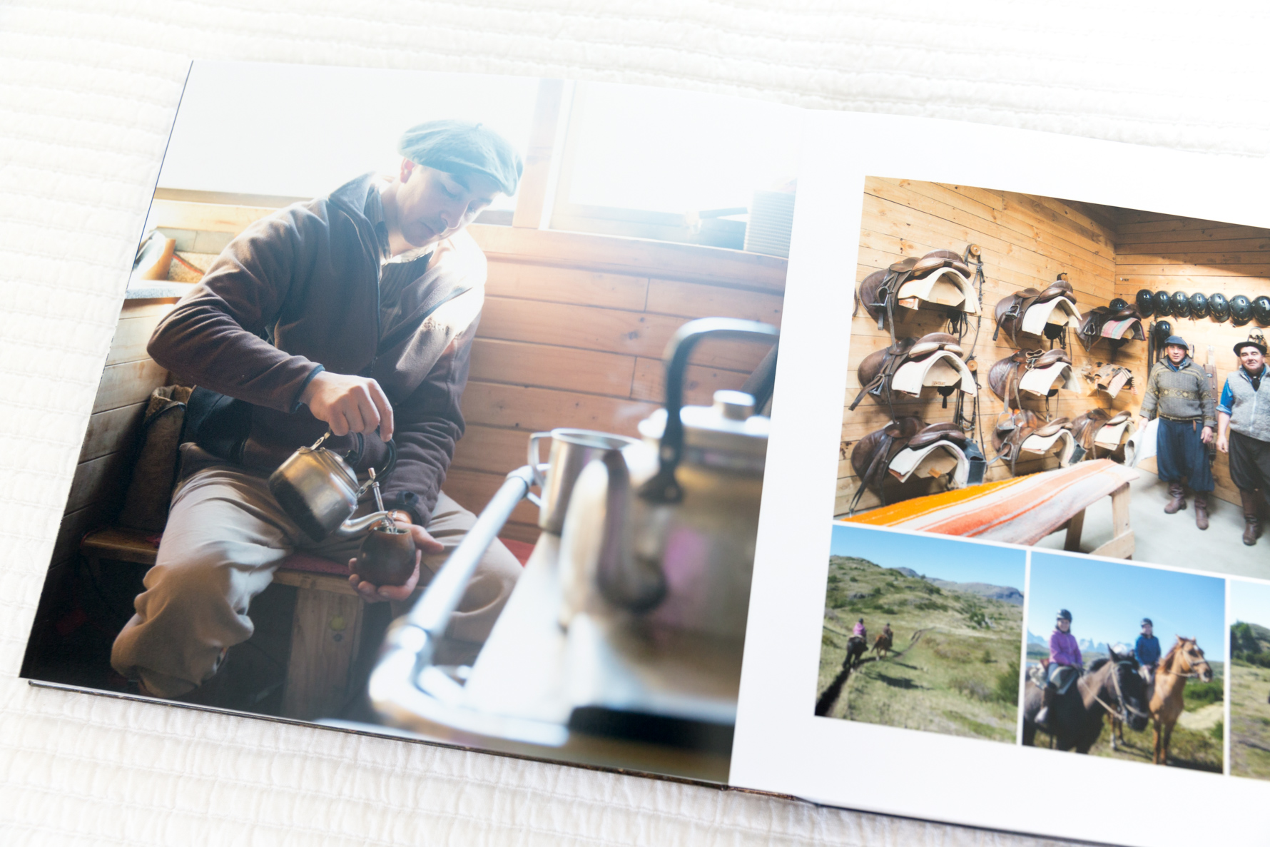
Those cute hats that found their way into many of our photos? They came from this sweet woman we met in El Calafate. We enjoyed her so much we went back to visit her a second time. The people you meet along the way are such an integral part of travel, and while it is not always comfortable to photograph them, I’m always glad when I work up the courage to ask for their permission and do it.
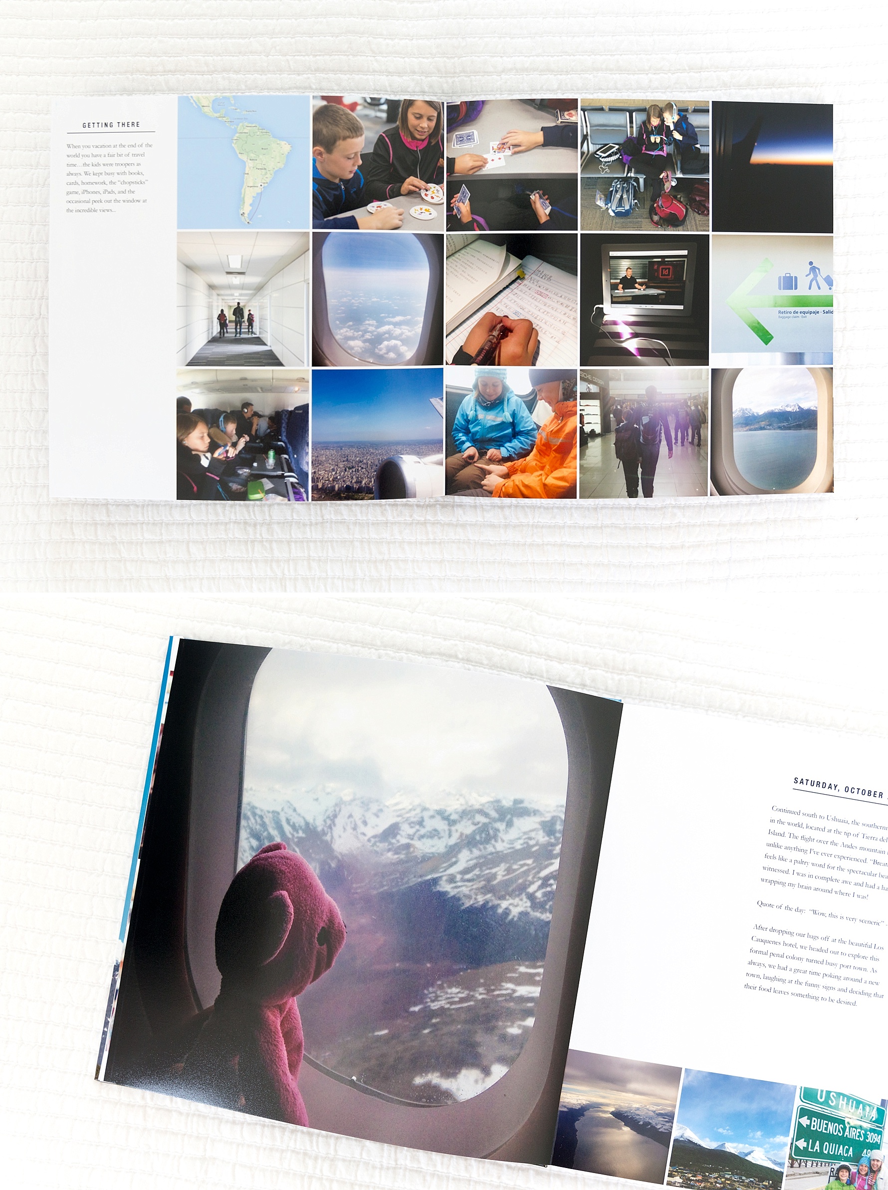
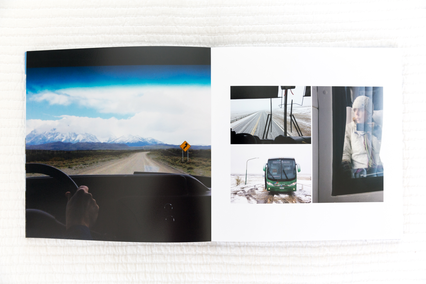
When you travel 30 hours to get someplace there are bound to be plenty of “Getting There” shots. Grouping them all onto one page made sense here as well as including a few other pages throughout the book that document our time on the road.
The moment we arrived at Hotel Explora in Patagonia I fell in love. Quite possibly the most beautiful place I have ever seen. The hotel perfectly reflected the natural beauty surrounding it, and I sprinkled more than a few hotel environment pages into the days covering our time there.
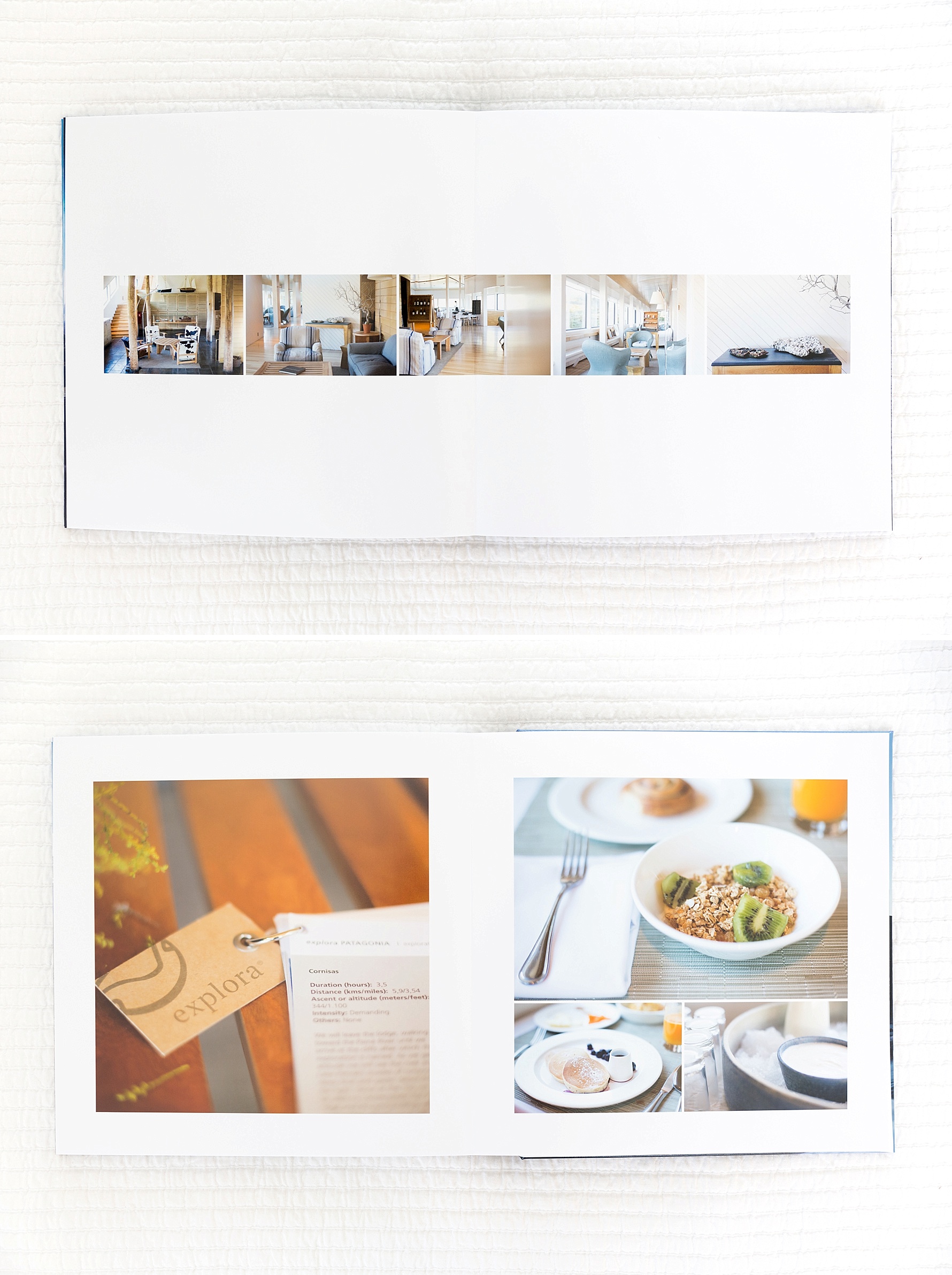
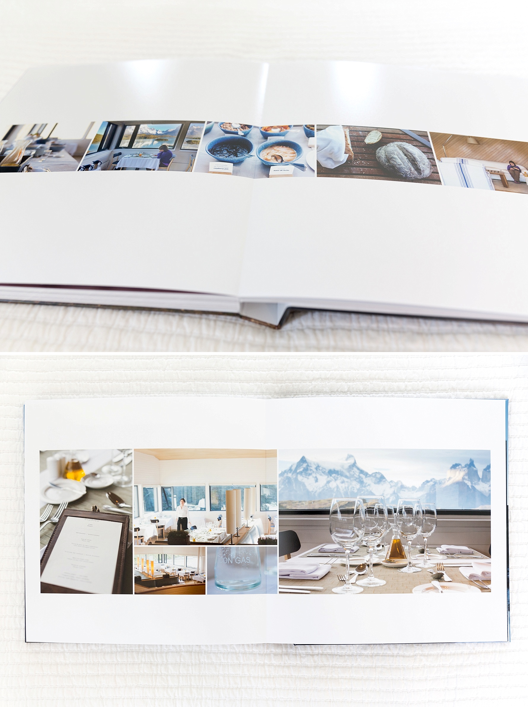
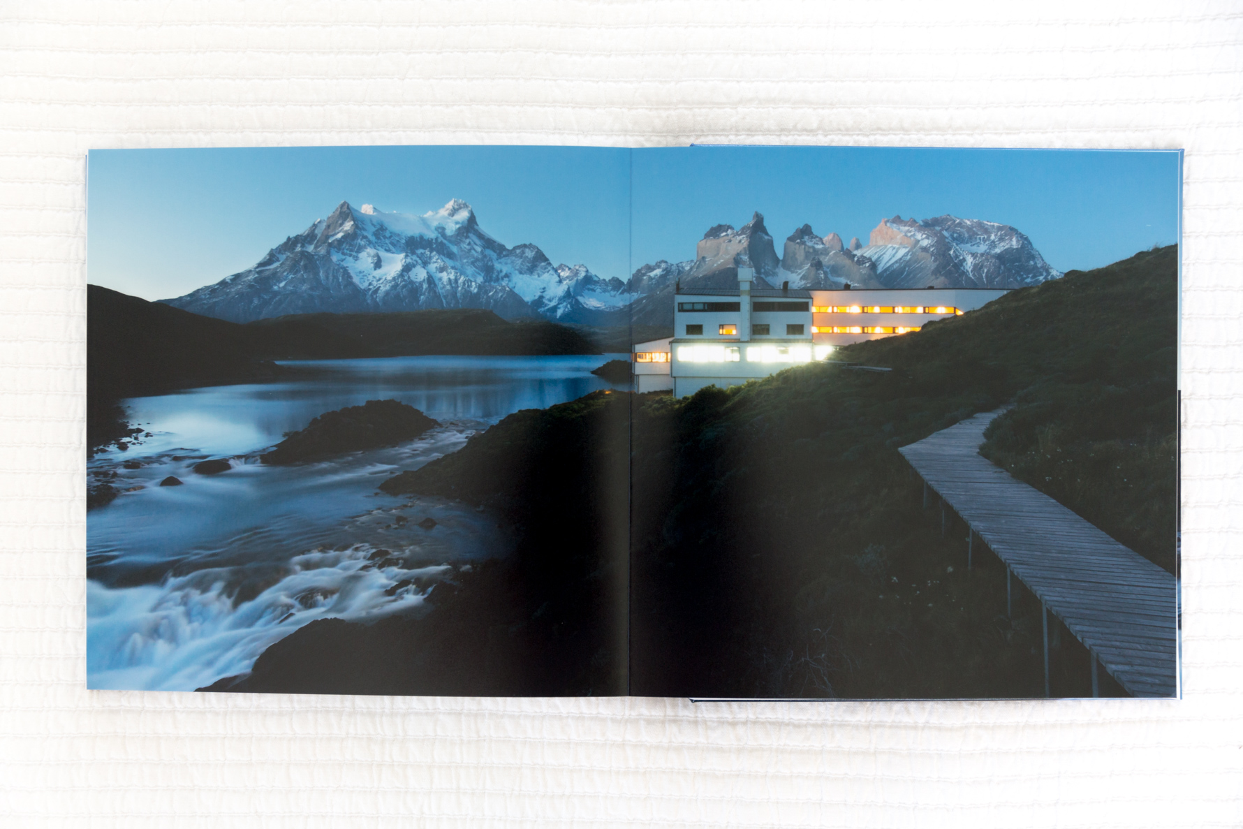
From the chaura berries found along all of the trails we hiked, to the guest book farewell notes, detail shots such as these rounded out our travel story and immediately take me back to those amazing family travel memories.
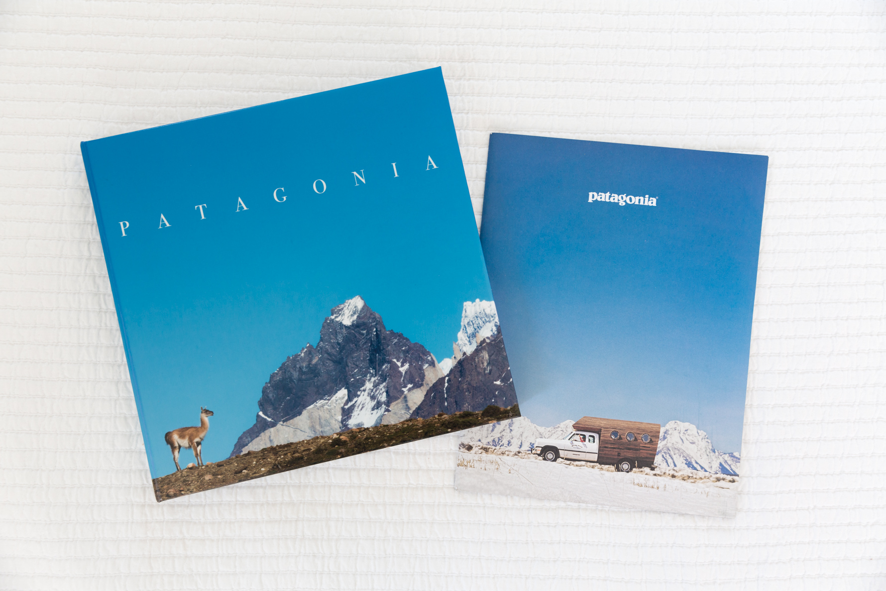
And when your completed book arrives in the mail the same week as a Patagonia catalog with a very similar cover, you know there is some special magic wrapped up in the whole experience.

Kristen says
This is amazing! What photo book company did you use for this book? I love the lay flat pages.
Kristi Boyd says
what a fabulous trip!! Beautiful pictures. So i have to ask,is it Artifact Uprising 10×10 flat?
Kristen says
Hi, I love your blog and have been following for several years. It has been motivational. I just finished 6 photobooks in the last 3 months. So thanks!! What photobook company did you use for this specific project? It seems a nicer quality than the yearbook ones I am doing.
Kristen
Suzanne says
Hi Kristin, thanks for the kind words and congrats on your recent accomplishment! See below for album info…
Suzanne says
Lots of questions both here and in emails about the album details so here you are: album was designed in inDesign and printed through AdormaPix.
Joanna Brinckerhoff says
Suzanne – Your work is so beautiful! I took your class on Big Picture Classes and have a question for you. You said above that you designed in InDesign and then printed through AdoramaPix. You also recommended other publishers in the class (who all look great). I just need to get past my paralysis and remember it doesn’t have to be perfect. 🙂
Do you set up your InDesign documents to be the size of the finished book (ex., 10×10) or make it larger for trimming?
Suzanne says
Hi Joanna,
Thanks so much for the kind words and joining me for my Photo Book 101 Course over on BPC! Oh yes, analysis paralysis is the real deal, but naming it can hopefully help you move past it 🙂
As for document settings in inDesign, I typically keep it simple and set as 10×10. But to be safe, check the FAQs of the printer you choose to see if they suggest differently. Tag me when you share the finished product, would love to feature your book!