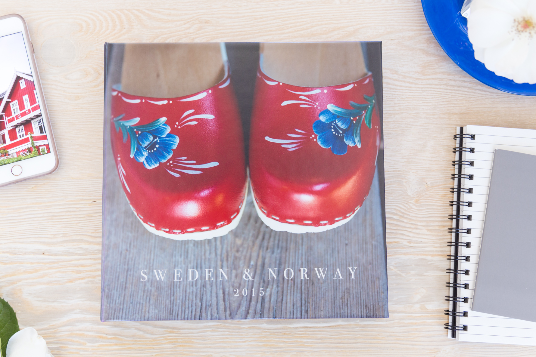
This week we are traveling to Europe, lingering for a while in Sweden & Norway.
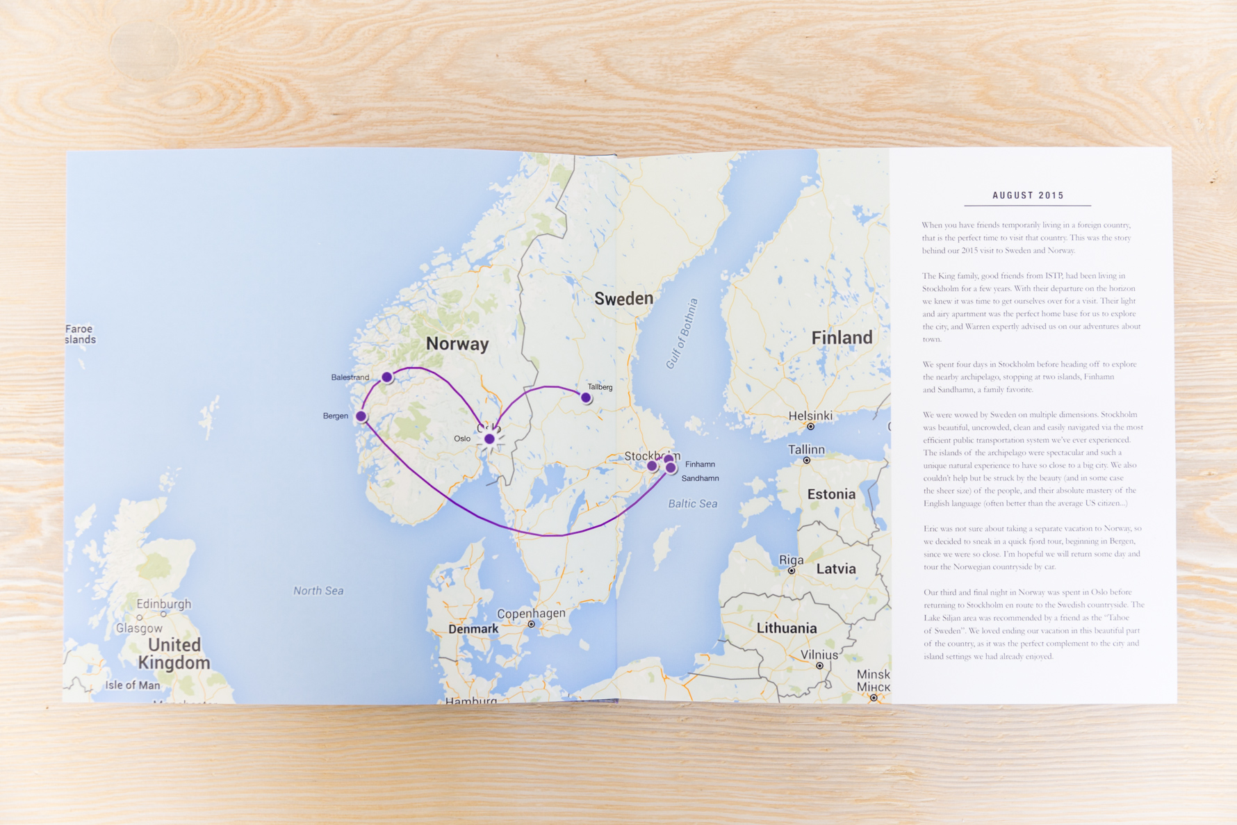
When friends were about to leave their expat post in Stockholm, we knew it was time to make our way over for a visit.
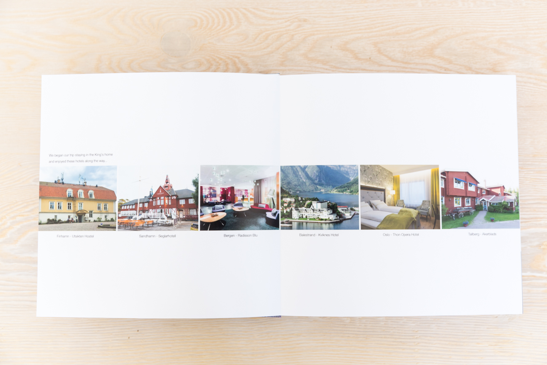
Since we stayed in multiple locations during our travels, this page highlighting our different hotels along the way serves as a quick visual timeline of our trip.
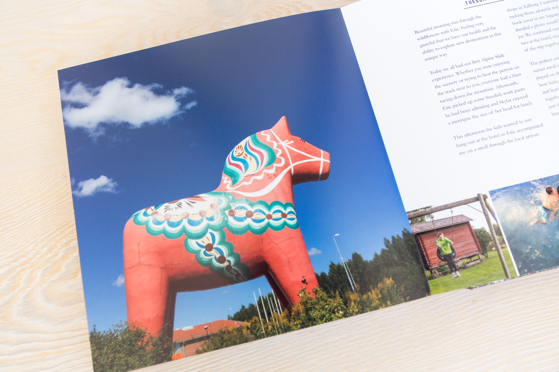
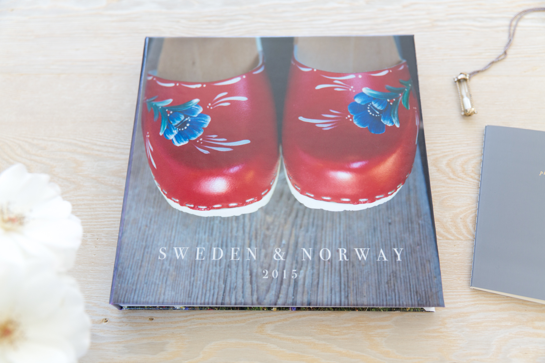
This iconic landscape harbor shot of Stockholm was under consideration for the book cover – ultimately I’m very happy I picked the less traditional choice of the fun clogs!
You may notice this book follows a similar design pattern to the Patagonia book I made just before this one. If something is working for me, I have no problem repeating a design to keep things simple.
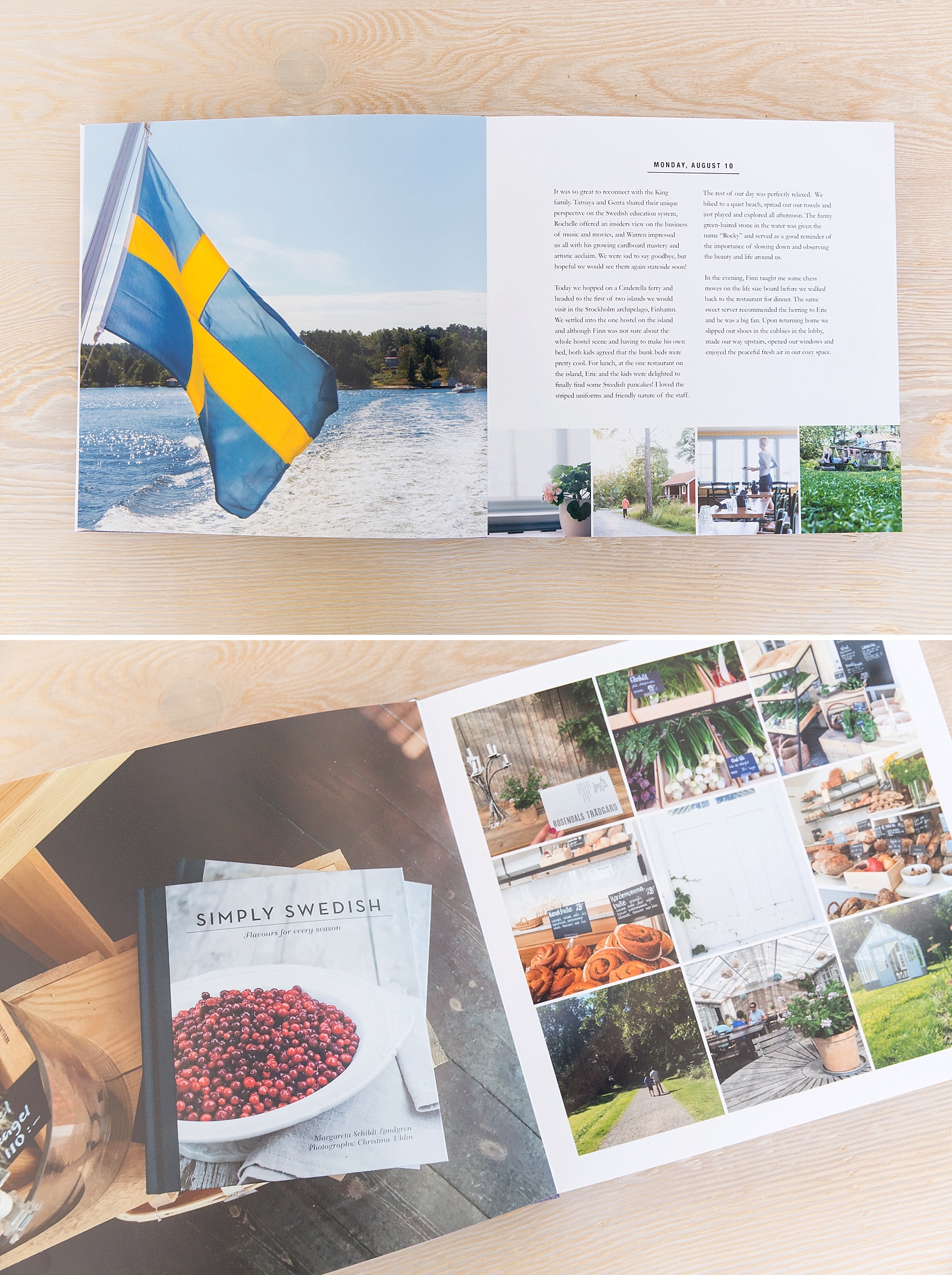
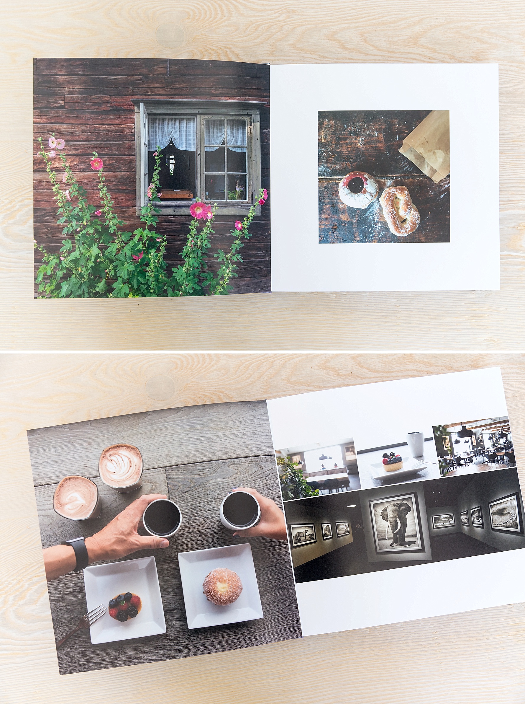
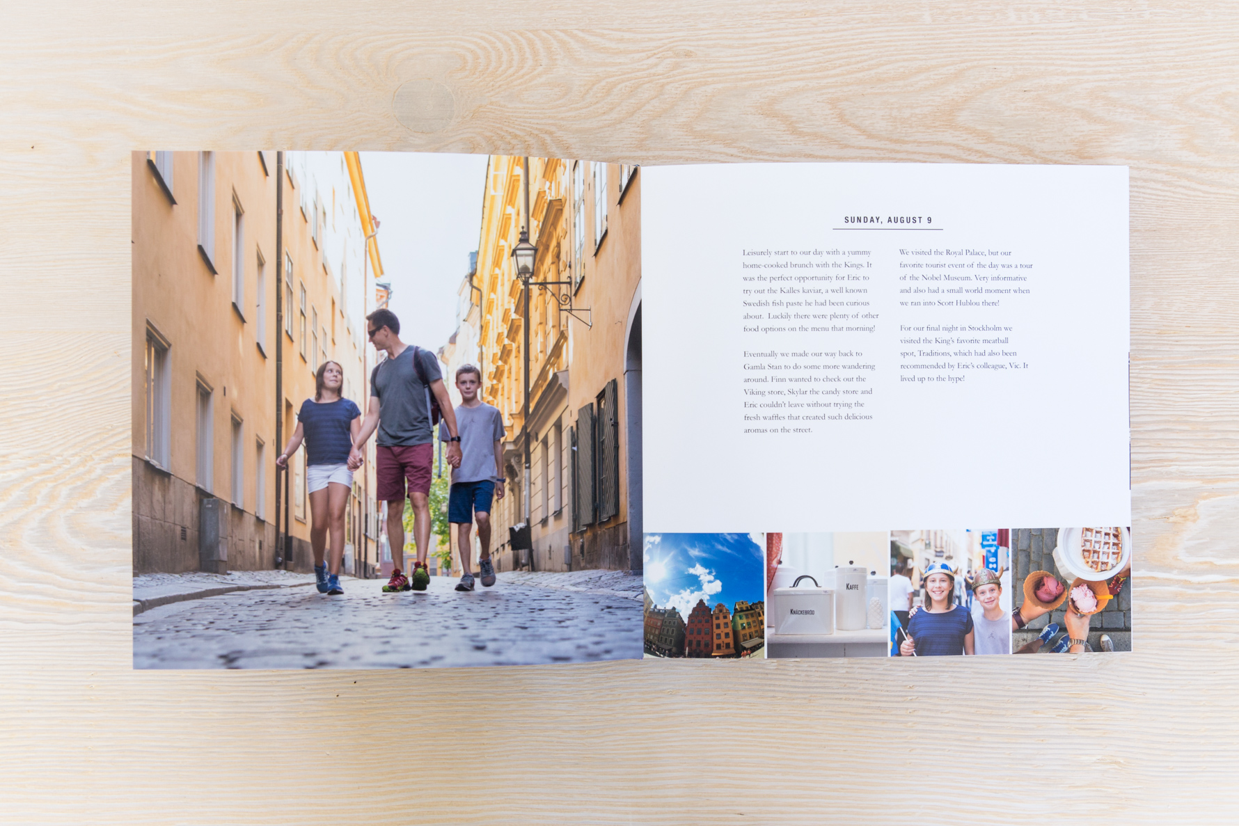
Keeping the text for each day consolidated on one page, versus adding a bit on each page, reduces the amount of moving parts in the layout design and that is always a good thing.
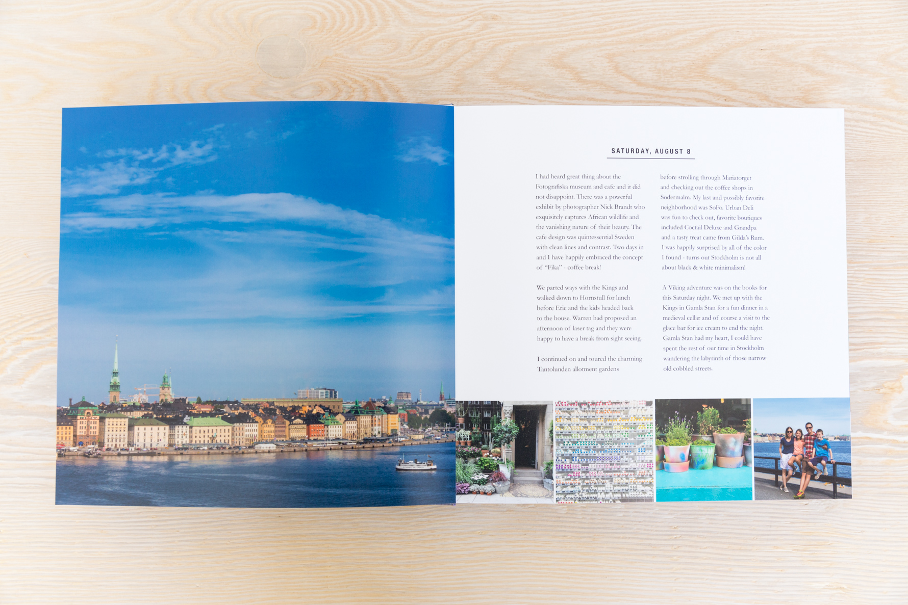
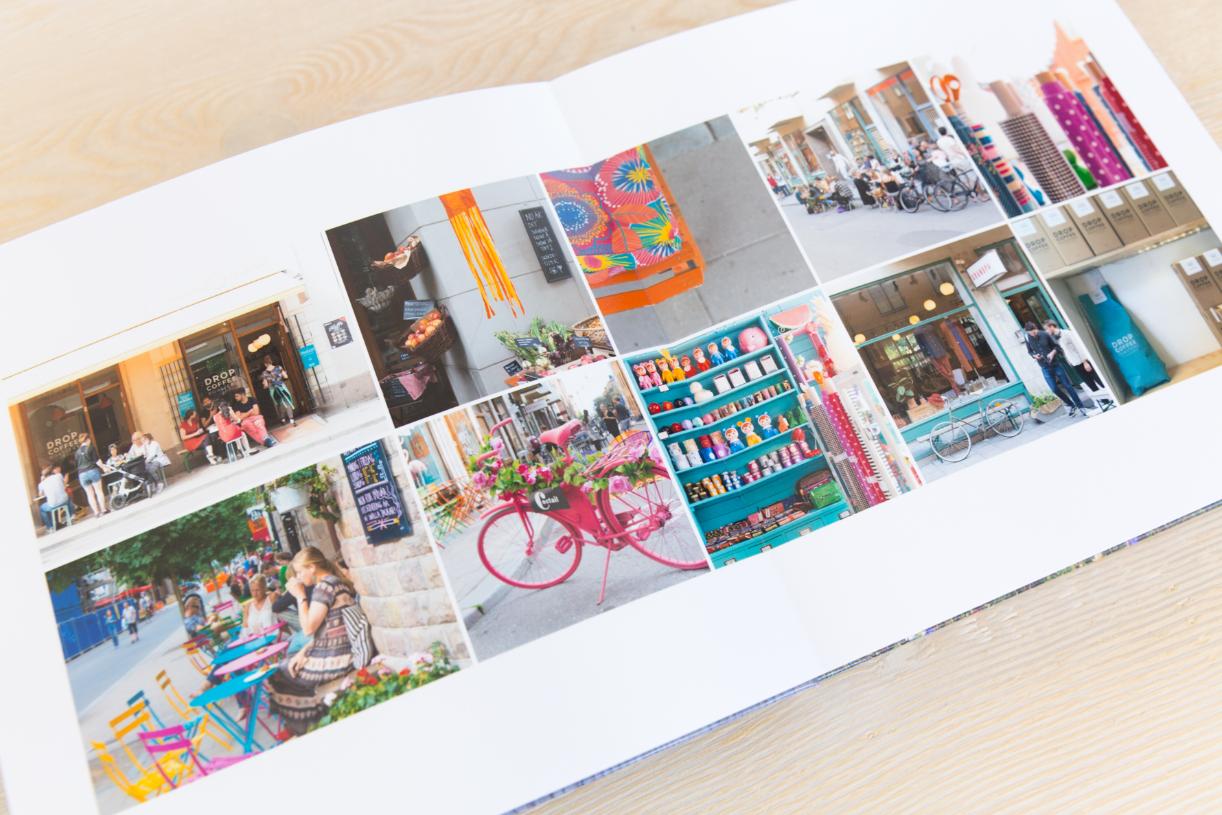
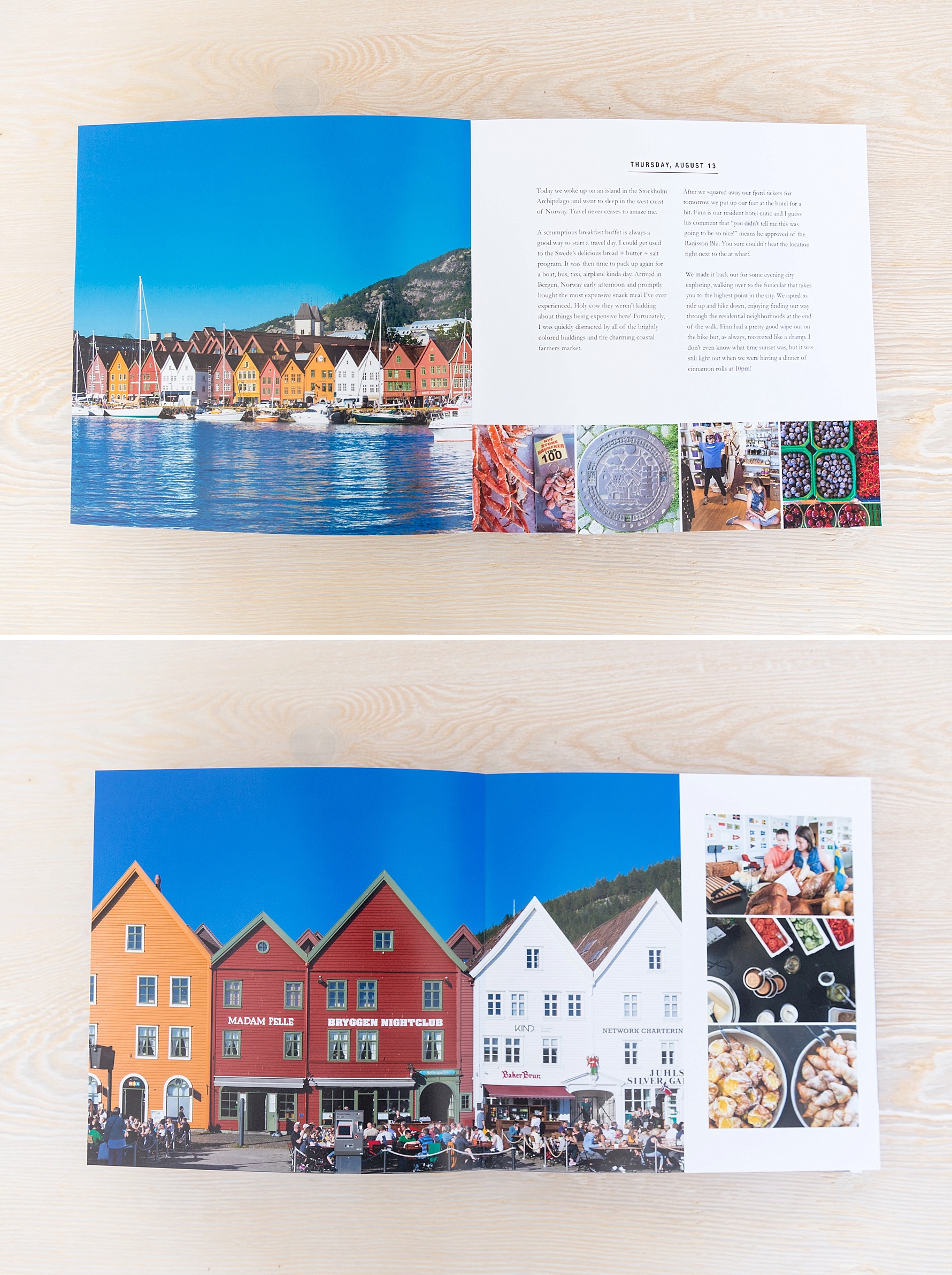
This is one of my favorite layouts from the book as it immediately takes me back to the few hours I wandered around Stockholm by myself capturing the happy colors and people of the city.
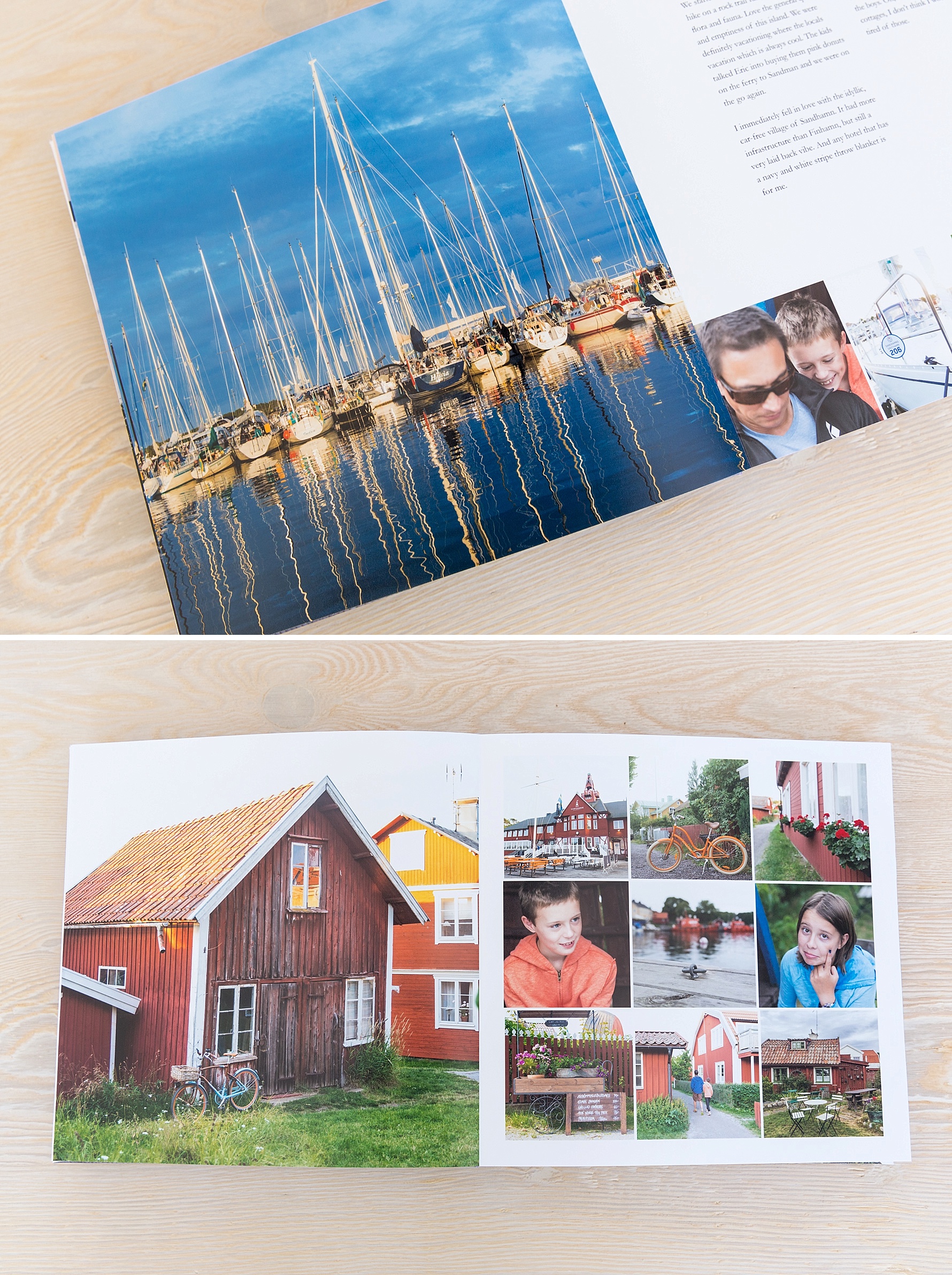
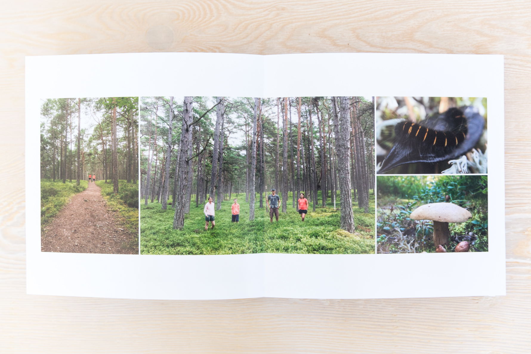
Lots of favorite pages from our time spent on the small picturesque island of Sandhamn in the Stockholm archipelago…
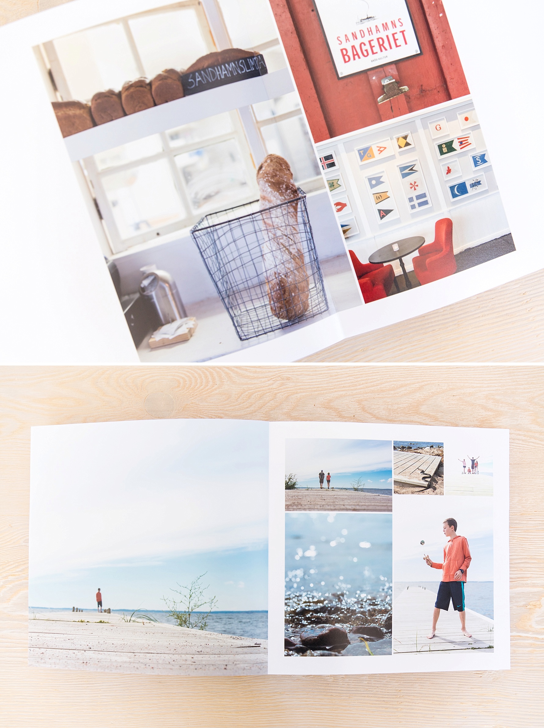
Oh, the bread. It was always served with the most amazing butter and salt flakes, as if this was of course the only way to enjoy this treat.
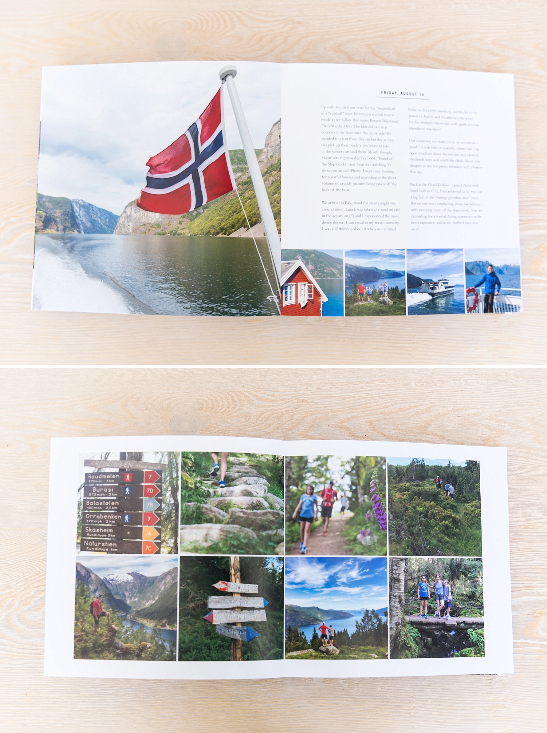
Our quick jaunt over to Norway for a classic fjord tour included all of the majestic beauty you would imagine. We left eager to return and explore the countryside by car someday.
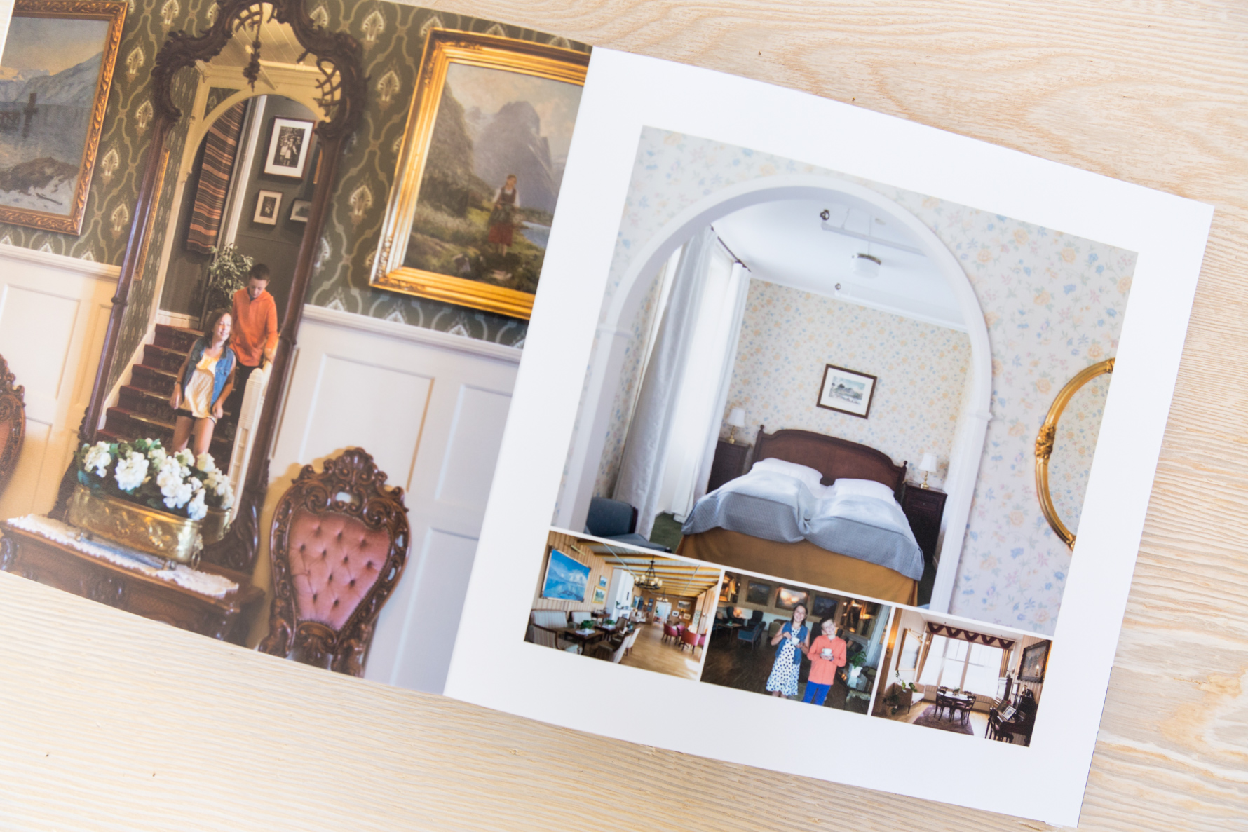
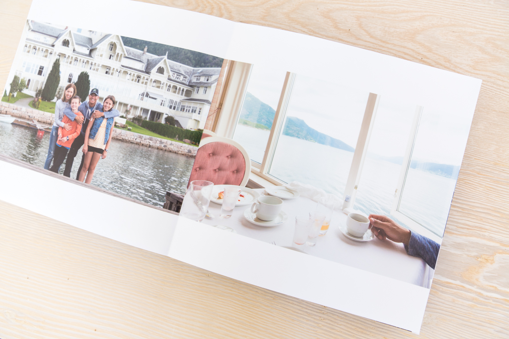
Although my son thought this hotel room was like a “grandma’s house”, I appreciated the charm and story behind the iconic old hotel. My kids are now pretty well-conditioned to let me take a shot of the room when we first arrive before it is full of our belongings…
I love how this layout includes my favorite storytelling 3 C’s (context, characters, close-ups) in just two photos. One look at that picture on the right and I’m immediately back at that amazing breakfast buffet, justifying one more trip up to enjoy the homemade rhubarb marmalade…
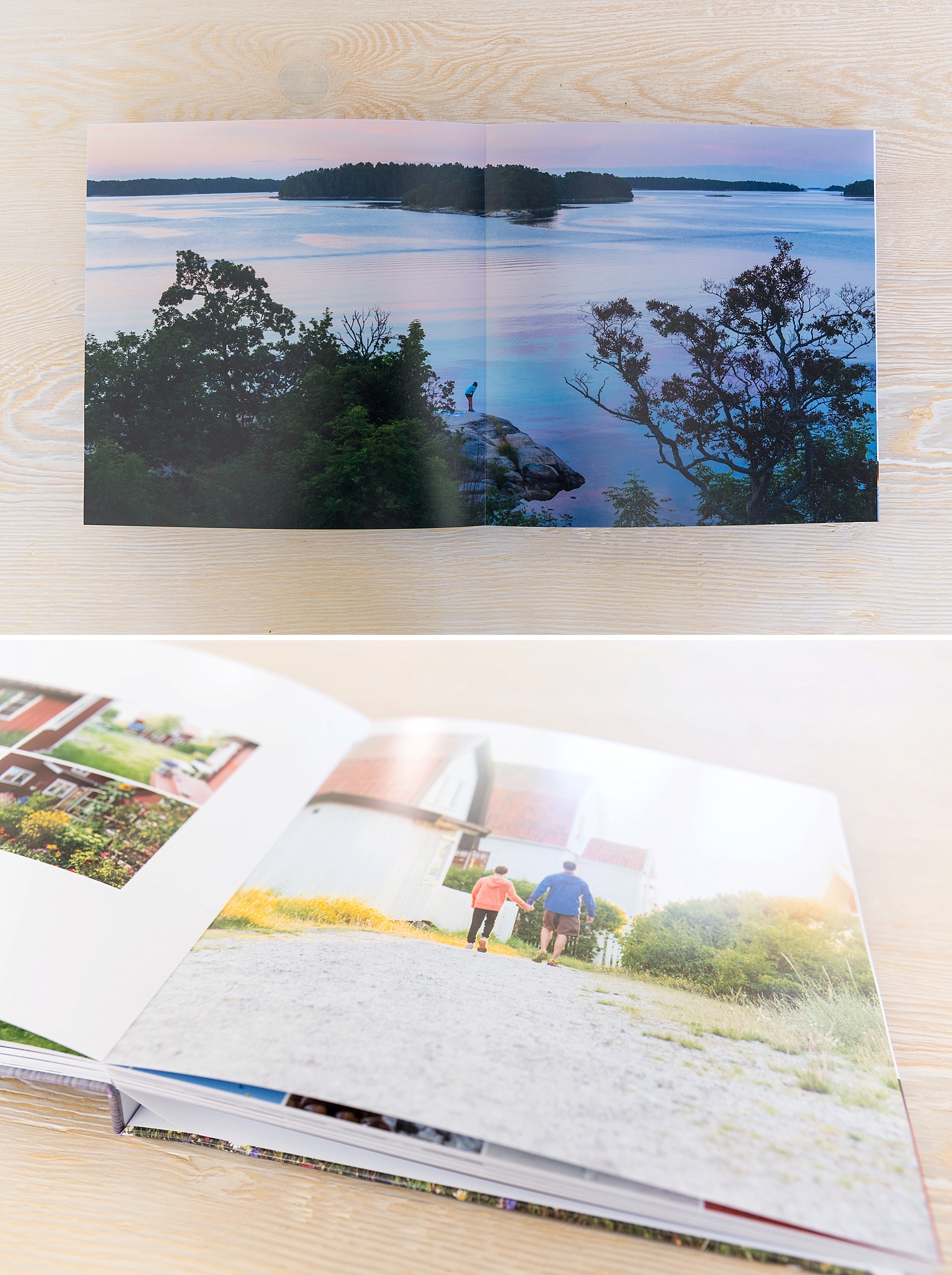
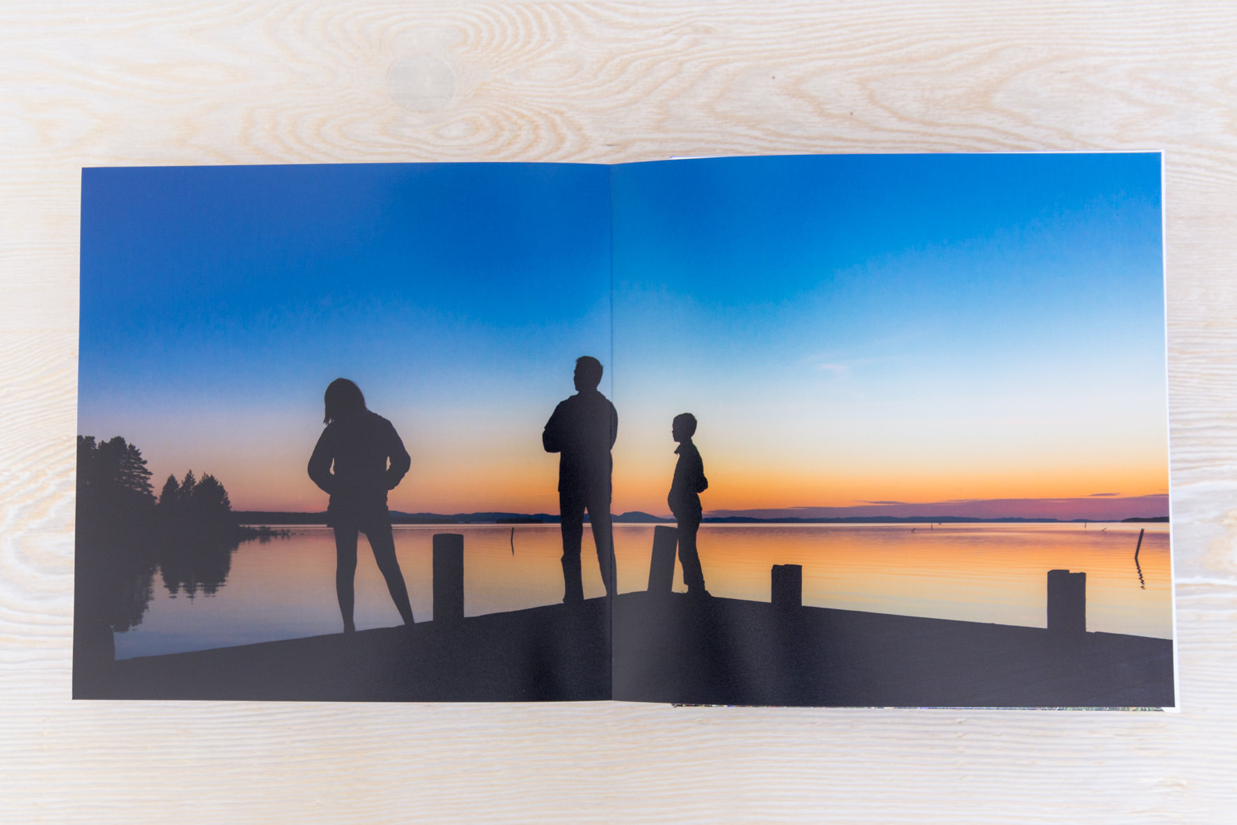
This story was brought to a close with this scene from our final night and a hope that opening this book in the future will be like returning to these destinations all over again…
Please click here to enjoy additional travel book inspiration!

Sarah says
Your travel photo books are a great inspiration! How did you do the personalized map? I want to make one for my recent trip to Scotland.
Amy says
Hi, These are great! what photobook company did you use?
Suzanne says
Thanks, Amy! These were printed through AdoramaPix.
Reah says
I agree. Your photobooks are wonderful. Great photos too. What camera do you use?
Suzanne says
Thanks, Reah! I use a combination of iPhone + Canon 5D Mark III DSLR when traveling.
Marie says
Your books are lovely! What fonts are you using?
Thanks
Suzanne says
Thanks, Marie! This book uses a combination of Bodini 72 (cover) and Helvetica Neue + Garamond (inside text).
Renee Cohen says
Hello,
your books are gorgeous! May i ask what size you usually get these printed?
Suzanne says
Thanks, Renee! These books are 10×10 – big enough to make a statement but not overwhelming and fit nicely on your shelf. Good luck!