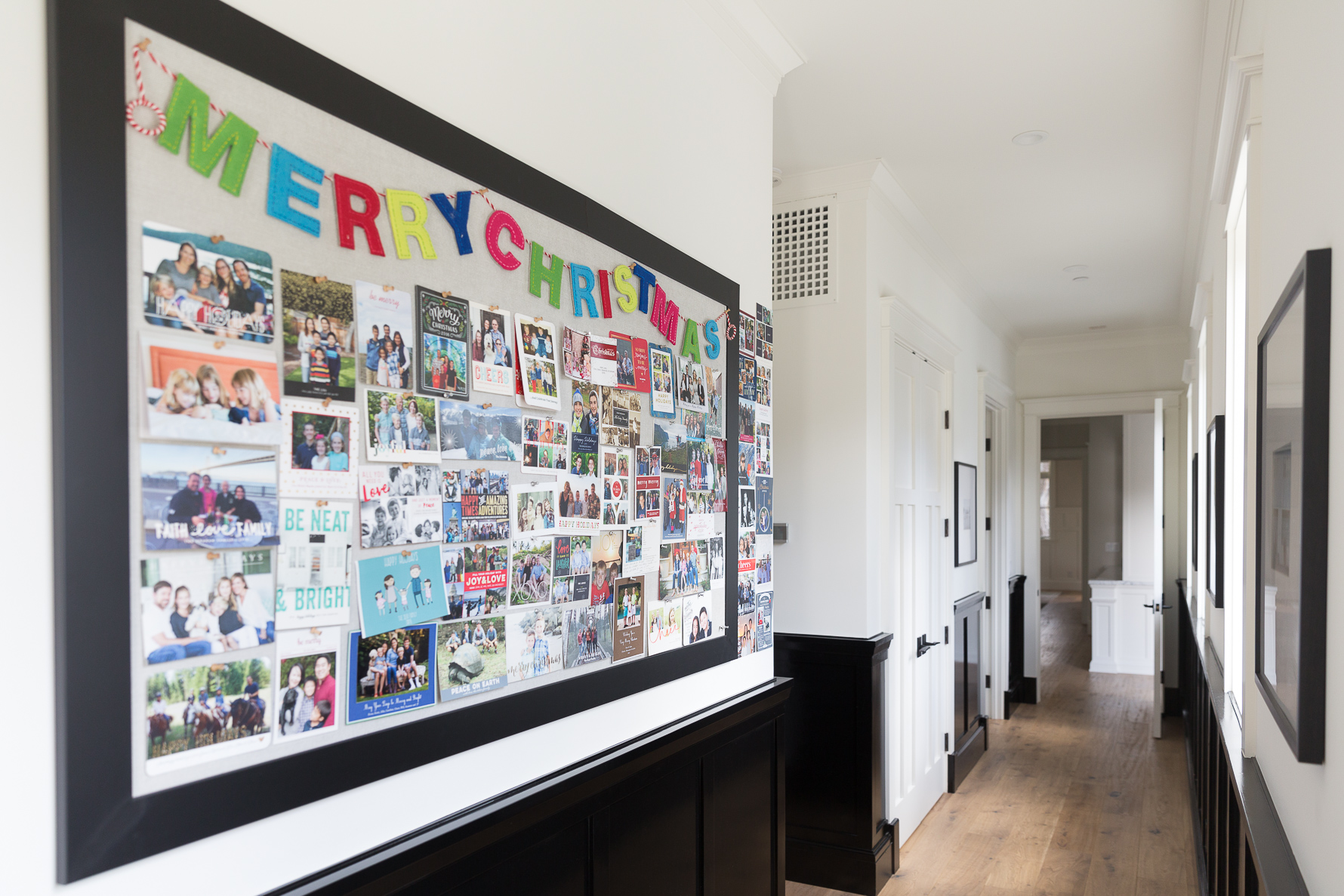
Filling up this bulletin board with the smiling faces of loved ones is one of my favorite parts of the holiday season. ‘Tis the season for making this magic happen, so today I’m popping in to share three quick tips to help you design your favorite holiday card yet…
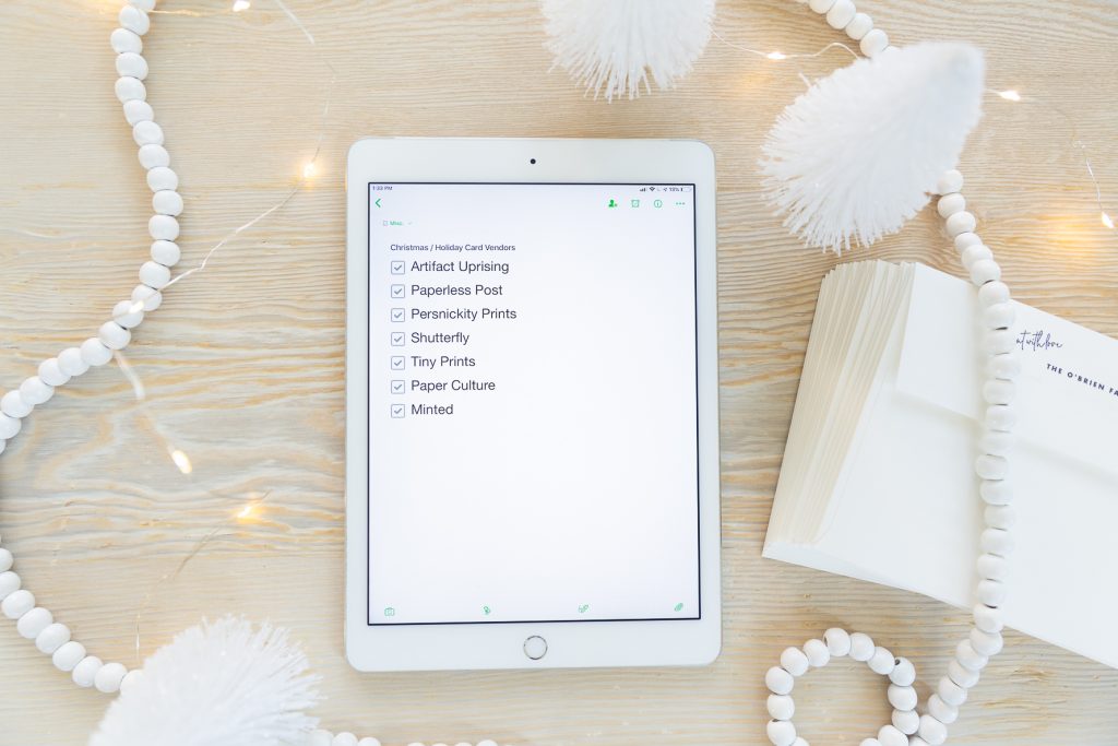
1 | Create a vendor list. I shop around to find the perfect design for my chosen photo every year. So many companies create amazing designs but I usually only find one perfect design for my unique photo. I keep an Evernote file with my favorite printers and every year I pull up that list and check the boxes as I hunt for the design.

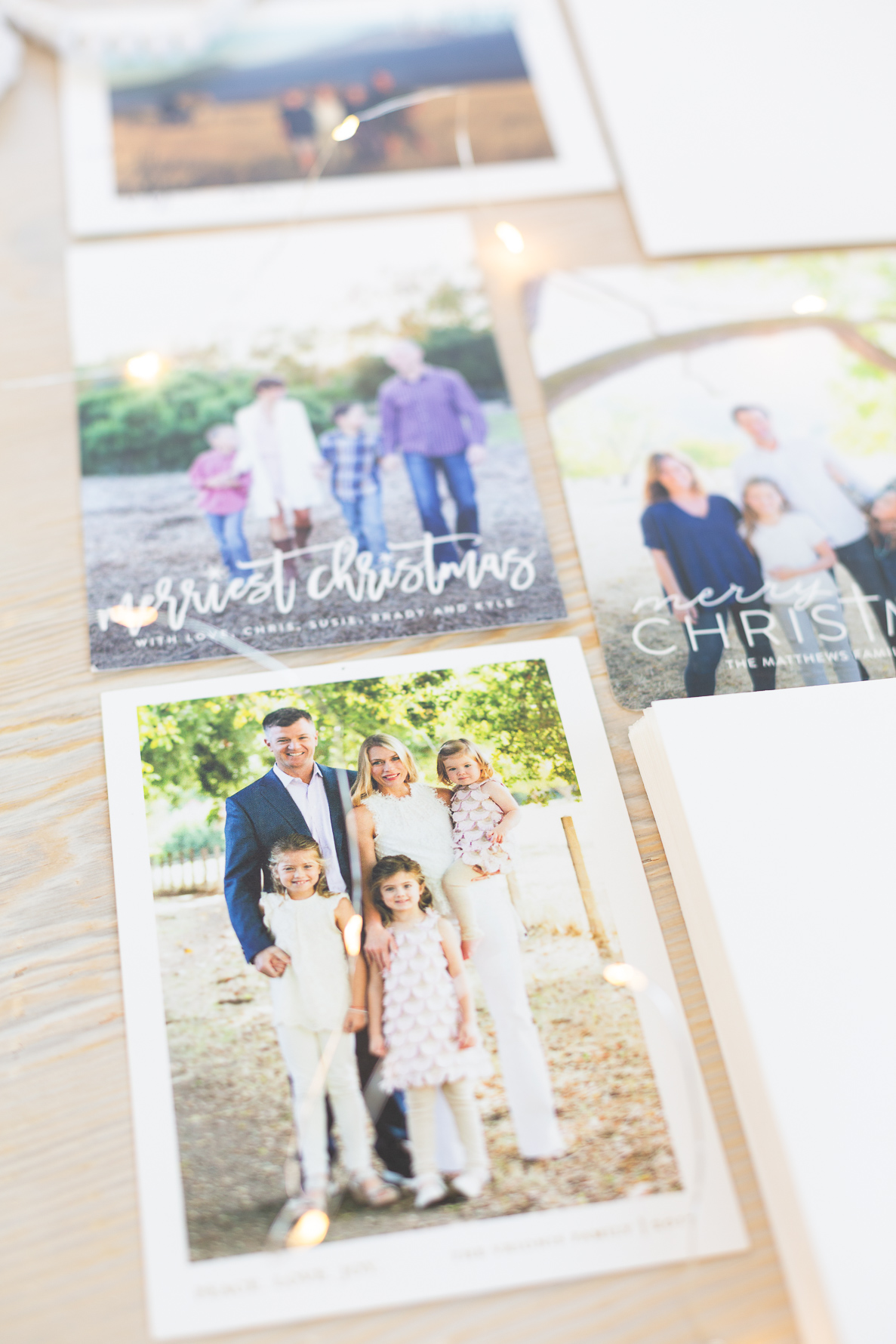
2 | Choose ONE great photo. This a personal preference – I love being able to really see your family, pick the one photo that allows me to do that. Here are a few favorite cards our family received in a previous year – all of them with one showstopper photo…
3 | Experiment. As I search for design options I screenshot any possibilities with my chosen photo in it. I then “Save” the card into my projects on that printer’s site so once I pick the winner it is easy to go back and find it. Once I’ve done all of my research, I import all of the possible design screenshots into Lightroom and select my favorite using Lightroom’s star rating system. Since the finalists are often coming from different websites, getting them all in one place allows me to easily compare and pick the keeper.
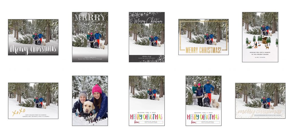
And the winner from that year was…

I chose this design because it kept the focus on the beautiful landscape of our photo. The “xoxo” also landed neatly in the white space and the rest of the text was subtle and not distracting.
I hope sharing this small part of my workflow gives you a few ideas for how to approach creating your family card this year. Would love to hear any other tips and tricks you have for knocking this task off your holiday to-do list!

